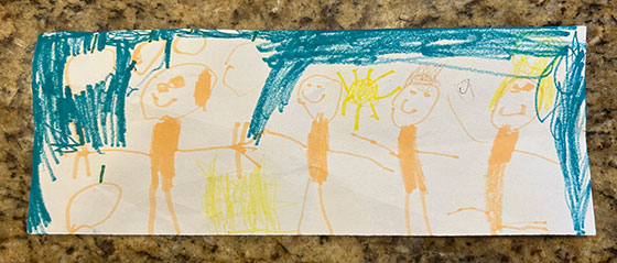
Dad Brog (#137): I’ve been waiting their entire lives for this

My kids made me bracelets for the first time.

There are randomly colored beads, pink, blue, green, yellow, white, red, green.  Some smiley faces, some flowers, an octopus, some eyeball-looking beads.  Some stars, a moon, and some random letters.

And they’re my favorite things in the entire world now, and short of showers and exercise, I’m seldom going to not be wearing them.

Even before I had kids, whenever I’d see a guy wearing some bracelet or some accessory that was clearly made by their children, I always thought it was sweet, and I admired their sense of security at not being embarrassed or afraid to wear their children’s creations, and I knew that those were the kinds of dads that I wanted to be more like rather than some stuffy stooge of a dad that doesn’t move the needle of what it takes to be a modern, supportive and loving father in this day and age.  Few things irk me as when I see content insinuating dads are distant deadbeats and have no connection to their kids, but at the same time I understand how that narrative came to be, and why it’s still in such prevalence.

All I really want in my life is to be the type of dad who breaks that sad mold, and be the type of dad that people can look at and talk about as being someone who loves the hell out of their children, is unafraid and apologetic about show affection and doing corny things like wearing princess apparel or colorful bracelets and other handmade jewelry.

Over the last few years, watching my kids grow and seeing their interests come and go, ebb and flow, I’ve always been waiting for the time in which they might, in some of their budding arts and crafts explorations, be in a position to make me a bracelet or a necklace, or some other accessory. 

That day has finally come, in which a mini bead and bracelet set was provided to them, and I came home to find that they had each made me a bracelet, and I couldn’t have been more over the moon to put them on and wear them with pride and love for my perfect kids.

And much like them, they are my treasures.

Dad Brog (#136): even bad behavior can be lovable

Sometimes when I come home from an office day, as soon as I come inside the door, my kids go running off mischievously like little shits.  It makes me smile and laugh all the same when they’re playful and being little shits together, and I don’t think anything of it.

The other day, I came home from the office, and as I walked in the door, I saw #2 run down the hallway, clearly following #1 in the day’s edition of hide from dada when he gets home.

And then I turn the corner and I see the marker marks on the wall. Then on the bathroom door, and then on the light switches and various surfaces. My jaw dropped at the incredulousness of them actually having drawn on the walls, as if I figured it was just some trope from a paint ad or something and that my kids wouldn’t actually do it themselves.

Naturally, mythical wife and I were pretty upset with this bad choice, and tried to calmly as possible explain to the girls that what they did was wrong, and why we were making them help clean the marks off of the surfaces they drew on.  Dessert and evening television were both taken off the table for the night, and they seemed to understand that they had made a poor choice.

The thing is, the following day, I was thinking about the whole incident but then I found myself smiling and chuckling about it, because of how the girls were working together and having fun together, and I really couldn’t feel that made about it.  The squeals of fun and laughter when I walked in the door is music to my ears, and even if they had vandalized walls in their own home, they did so in the name of having fun together, and I just couldn’t be upset with them any longer.

I know that there will come a time when such sounds and behaviors won’t be happening any more, and it’ll make me sad to come to the realization that my kids are too old and grown past such playfulness.  So even if it means that they’re making bad choices and doing a little bit of destruction of property, I don’t think it’s the end of the world if they’re doing it together, having fun, and learning afterward that their behavior was not acceptable in a calm and rational response. 

Let’s talk about the WWE’s new tag blets

In one of those I should’ve seen it coming but I didn’t, the WWE has recently redesigned and unveiled new tag team championship blet designs.  Over the last few years, almost all the blets have been systematically been redesigned from top to bottom, except for the tag blets, which were still red for RAW and blue for Smackdown. 

Blets being in the middle of a reign didn’t seem to matter for when to unveil new designs, as Roman Reigns, Asuka and Rhea Ripley all received the new versions of the blets that they had held, but for whatever reasons, the Usos having the combined tag team championships on lockdown didn’t warrant swapping of those designs, but seeing as they were broken up and sent off to different shows seemed as good as time as any for the E to finally unveil new titles.

When the new World Tag Team Championships were unveiled on RAW, one I was happy for the Miz and R-Truth, two WWE lifers who are the consummate pros who do anything and everything they are asked for, do it well, and always manage to get absolutely anything over.  But two, my knee-jerk reaction to these blets were that I was relieved to see that they were finally gold blets again, seeing as how fewer things made the tag titles feel lesser-tier over the last 10+ years than the fact that they were bronze and then silver plates.

The shade of gold, amount of flourish and the weird griffin chimaera creatures made me think that this perhaps could’ve been a previous version or option of the World Heavyweight championship blet that ultimately ended up looking like a spin-off of the old WCW big gold blet in terms of its general shape and composition.

But overall, I do really like the new World Tag Team blets, except for one thing – the font they used on it.  Not digging the spiky, Glaive-like typeface they used, and it looks like they’re trying to be a 2005 RAW graphic package with it.  Furthermore, the type is just too fucking large, and much like my general aesthetic preference when it comes to clothing, I think when apparel requires too much text to explain it, then it’s design that is not optimal.

If the fonts were smaller, I could overlook the undesirable typeface selection, but overall, I’m pleased with the way the new World tag blets look.  Not sure if I’d want to own one, but typically a really good discount has gotten me possession of other blets I’ve felt similarly about.

Obviously, once RAW had unveiled new tag blets, among the first thoughts I had was pondering what Smackdown was going to do, because it was obvious that they were going to get a redesign as well.  But the question was, was it going to be carbon copies of the RAW titles, but with blue paint behind the globe and type?  Or was it going to be something completely independent?

Fortunately, the answer was just days away, when Smackdown unveiled the WWE Tag Team championships, with blets that looked completely different from their RAW counterparts.  Immediately, my eyes noticed the familiar shape of the center plate, which was an obvious throwback to older tag team blet designs, that had what I like to jokingly call the nutsack shape, because for whatever reason, the bottom has two bulges like a pair of testicles.

Regardless of the homoerotic comparison, my knee-jerk reaction was still positive.  I liked that it was a completely different design, and this will prevent any future embarrassing title swaps in future draft storylines.  It’s general design is much more muted and subdued than the World tag blets with its design being more etched and not molded.  In doing so, it does look like a cheaper blet in comparison, but as far as design goes, it’s a preferable design over its counterpart.

The font treatment is much more subdued and exactly how I prefer it, and the throwback shape of it is pretty much all that it needs to have to be the preferable of blets between the two.

What it all boils down to is if I had to pick one, which would I go with, and that would be the Smackdown WWE Tag Team blets.  The homage to the classic design is fantastic, and even though the World is the more detailed and nicer looking blet, the font is a turn-off for me

Either way, I’m glad to see that the E has redesigned both, because in the future when the tag blets are used as a prop or a means to reward two mildly over singles guys, at least they’ll look good holding some actual gold straps instead of silver-plated toy-looking blets.

Finally, a sponsor patch I can get behind

See ya next time: Kansas City Royals announce a partnership with QT gas stations, including a sponsorship patch on all team jerseys

Sponsorship patches seemed inevitable in MLB, seeing as how sponsorships on jerseys have been pretty commonplace pretty much in every sport in every other country across the globe.  But America being ‘Murica, it was unsurprising that once they started coming to fruition, all the sponsors were all of these boring, homogenized, multi-million dollar entities that nobody has ever heard of, cared for or generated any sort of emotion other than ambivalence, indifference, or the need to make fun of them.

The New York Mets, of course, were one of the first ones to really mess things up by introducing a hilariously oversized patch that nobody is going to convince me probably didn’t mess up the performance of players, since they had this giant square of weighty fabric hanging off of their left sleeves, that they had to finally swallow their pride, admit my bad, and fix it.

Of course, the Atlanta Braves got into the action as well, seeing as how Braves Corporate™ loves money and will do absolutely literally anything if it meant pleasing shareholders or improving their portfolio.  And despite how amazing it would’ve been if it were something truly iconic to Atlanta like Coca-Cola, Delta, The Home Depot, or my personal favorite thing I would’ve marked out for, Waffle House, nope, had to be a boring-as-fuck bag of concrete Kwikrete instead.

But today, we have news of a partnership that truly makes me smile, from the satisfaction of it being a team I don’t dislike, a company I don’t dislike, and all of the positive associations I get from said company, and knowing two parties that I don’t dislike coming together to make business.  It’s like when you have two friends from separate circles meet, and they gel together well.

But the Kansas City Royals partnering up with QuikTrip is something that does bring me joy.  The Royals are one of those teams I can’t ever bring myself to dislike, and who could forget the 2014 and 2015 seasons when the Royals came close, and then succeeded on their redo.  They’ve always had players that I’ve generally liked* and they so rarely ever cross paths with the Braves, so there’s almost never any chance that I’d ever feel the need to root against them.

*except Melky Cabrera, that fat worthless fuck who went to the Royals after his putrid stint with the Braves, where he played the season at like 304 lbs. before losing a hundo when he joined the Royals and put up an MVP-type season

And then there’s QuikTrip, which actually has a lot of Georgia ties, with their food distribution centers, I have a lot of positive connotation when I think about them.  Often times with the cheap fuel, always open, decent food as far as gas station grub is concerned, and always with expedient and mostly friendly staff.  I often tend to favor a QT when given choices, and when I think of QT, I hold them in a positive regard.

So the Royals joining forces with QT, makes me pleased.  Especially, with them hilariously slapping a giant red and black QT logo onto the Royals jerseys which are a hard blue and white identity, which really begs the question on the importance of branding.   Like, if the name of the game is for the sponsor to really stand out, they couldn’t have picked a better team to partner up with than the Royals.  If they partnered with the Cardinals, Braves, or even the Diamondbacks, which are all markets that have QTs, their logo would blend in with all the other reds that those teams employ.

I don’t travel much anymore these days, and my baseball journeys are long past complete.  But I’d totally be down to go to Kansas City if they ever did a free Royals jersey giveaway night sponsored by QT, where they were giving away jerseys with the QT logo on them, because to my knowledge replica jerseys made by Nike/Fanatics don’t include sponsorships on them, and I sure as fuck wouldn’t want to buy any of the shitty replicas made by them these days anyway.

Either way, Royals + QT, and a bigass sponsorship patch on their blue-ass jerseys definitely piqued my interest, and I look forward to seeing Royals highlights throughout the upcoming season.  This is definitely my favorite sponsorship partnering there is in baseball, without any question.

Dad Brog (#128): Breaking Dada again (in a good way)

It’s been a long time since I made a Dada post.  It’s been a long time since I’ve actually taken the time to write, for the matter.  It’s not that I haven’t wanted to write, I just simply have had no time to write, because my life is chaotic, my kids come first, been too busy, and it doesn’t help that I’m insufferably neurotic about having the right conditions to take the time to write.

I’ve got a laundry list of topics that I want to write about, and it will be a challenge to retroactively try to get into the headspace necessary to write about them and try and fool my zero readers that they’re fresh and happening when they did but it doesn’t mean I won’t try either.

But this post, at least, is about as a live and real-time, genuinely written on the day in which the thoughts formulated in my head, which is about as good of opportunity as any to get back on the writing horse and hope that it gets the ball rolling again to where I can also knock out some of the other things I’ve wanted to blab about over the last few weeks.

One thing that I’ve always looked forward to as a parent, was the day in which my kids’ creativity developed to where they could start creating, things.  Drawings, paintings, sculptures, whatever, but tangible things that they make from nothing.  And over the last year and change now, with both of my kids in school, my kids are sent back home on the regular with papers of general scribbles and some developmentally appropriate artwork that they do, and me, being the sap that I am, have basically saved everything, no matter how inconsequential or scribbly they might look to others.  They’re my kids’ first forays into artwork, and for the time being, I’m hoarding them like I want to end up on TLC, and look forward to looking back at them with my kids in the near future.

But today, I come home from work, and when I’m reading to #2 on the couch, #1 comes to me with a person made out of bristle blocks.  She says, this is Dada.  Nobody notices it, but my lip immediately pouts for a second, because I’m cracking just how touched I am at the seemingly innocuous gesture that means the world to me.  Moments later, she comes back with another one, shorter, and says that this is me, and puts it next to the Dada figure.  I have to stop reading at this point because I’m holding back tears at this point, because I’m breaking in the best way possible, and my sniffles I try and act like it’s the seasonal bug that’s been passed around my household over the last week.

After I tell her how much I love them, she vanishes again, and minutes later comes back with yet another figure, the smallest one of the three, and says this is sissy, and I’m just about the happiest dad I’ve felt in a few days at how much I love these kids, and marvel at just how much they seem to grow on a daily basis.

Naturally, #2 destroyed them before I could take a picture of them, but I’m sure now that they’ve gotten such a positive reaction from me, #1 will probably make them again, to which I will definitely require some photographic chronicling of such happy thoughts.

All the same, I’m really looking forward to the day when my girls start making stuff like bracelets and necklaces, and I can’t wait to wear colorful and vibrant accessories that don’t match any of my office attire or anything else I wear, because fewer things will have more meaning and be more treasured on my person than the things that my own kids make, especially if they’re meant for Dada.

Praise for TNA’s blet refresh

Initially, I wasn’t really keen on Impact Wrestling re-branding back to TNA.  There was just this bush league reputation of TNA that always stuck with me that involved Jarretts, Dixie Carter, strange booking, Cups for no prizes, convoluted booking, the six-sided ring and a drunk Jeff Hardy that I didn’t think was a good idea to going back towards.  I always felt that Impact was a respectable endeavor of scaling back, restructuring, reinventing, and growing back towards respectability.

Especially compared to the questionable things that AEW does, I found Impact to be the more refreshing alternative to the predictability of the WWE, and over the years, I’ve always made a point to hit up Impact when they stopped in Atlanta, and even liked their product so much, it inspired me to get an Impact replica blet, as bootleg Pakistani as it undoubtedly was.  I enjoyed what they were doing, and I respected the fact that they weren’t necessarily trying to compete with the Joneses and were out there, as a solid #3 promotion, doing their thing, letting people work, and putting out decent product.

But I kind of get it why they wanted to go back; probably if for anything, because all of the noteworthy promotions in the land are all three-letter acronyms, and being “and Impact” might’ve felt like being way too much of an outlier.  WWE, AEW, ROH, NWA, GCW, PWG… and Impact.  Perhaps there’s just something about three letters that means wrestling, and just like that, TNA is back, and the Impact name reverts to being the flagship television show.

Regardless, if there was one fun thing to come out of the rebrand was the inevitability that there would be new blets, because Impact blets sure as heck weren’t going to fly in the land of TNA.  And I have to say, despite my reluctance to accept the TNA name back into existence, as far as their refreshed lineup of blets across the promotion, I have really nothing but praise.

They did the smart thing, and refreshed them all at the same time, so they can have something of a cohesive and uniform look to them.  Not like when the WWE updates the US title in 2020, the Intercontinental blet in 2021, a 24/7 title that came and went in the blink of an eye.  I didn’t know who ZBro’s Belts was, but after seeing how great these TNA blets came out, I dug to find out who the maker was.

I appreciate that there’s both cohesion as well as variation with all the blets, and they don’t all look like the same fucking blet like Ring of Honor’s entire lineup of titles look after Tony Khan bought them.  Gold for men and women’s top prizes, red straps for the tag blets.  The X Division blet has come leaps and bounds from when it was basically just a big red X on a blet, and looks like a solid #2 prize, and I know it gets a lot of criticism mostly for its name, but I really dig the updated Digital Media blet.  I love how it has kind of a circuitboard pattern in the background, and there was obvious thought that went into its design as opposed to copying bits and pieces from Japan and UK to create a bunch of AEW midcard titles.

As for the inevitable question on whether or not I’d entertaining getting any replicas should they be available, legitimately or though Pakistan, there’s always the possibility for the right price.  I’d honestly go for a Digital Media championship first, and if I ever had the disposable income, even go after a set of the Knockouts Tag Team blets for my girls, especially since these don’t have the goofy-ass Garfield Copper font on them like the old ones did.  The others, would be dependent on if any workers appear to be doing good enough work to inspire me to want to get one, and if Nic Nemeth captures the world title, it just might be enough to get the job done.

The manufacturing rights to the Batmobile go to Nissan??

Apparently, it happened nearly a month ago, but because I live under a rock, I obviously missed out on it until it was spoon-fed to me from a targeted ad; but there was some car show out in Japan where all the manufacturers unveil new shit, and among all the general noise, emerged the fact that Nissan is basically making, the Batmobile.

They’re calling it the Nissan Hyper Force, which sounds more like it should be a Power Rangers Zord, but from the looks of the concept, come on, it’s the goddamn Batmobile.  The sharp lines, the design meant for optimal aerodynamics, that every flare and angle, basically looks like Lucius Fox himself designed it.

I don’t care enough to deep dive into reading everything about it, but this snippet I saw basically encapsulates the vehicle as a whole:

The Nissan Hyper Force is designed for racing enthusiasts and gamers who crave the adrenaline rush of the racetrack but are also eco-concious.

There are a lot of assumptions being made here, like assuming mutual exclusivity between being gamers and those who have the balls and means to get out onto the racetrack and I feel like such couldn’t be any more incorrect, but in the land of marketing, people will say whatever the fuck sounds like it can capture the imagination of some gullible saps into thinking that they can not only tackle Akina, but also do it green.

But not likely to be in the brochure are that drivers will feel compelled to tap into their inner vigilante and go out and fight crime.  Also, hack their car and find out ways to install sophisticated self-drive mechanisms to drive to you on command, as well as have hidden compartments for smoke bombs, gatling guns, and my favorite Batmobile gizmo, the grappling hook to make the smoothest 90 degree turn without having to slow down in history.

Either way, kudos to Nissan for being the car maker who decided to have the stones to take on the Batmobile, and all the tryhards in the future who will get one for absolutely no other reason than that it’s unofficially, the Batmobile.  I think if I don’t get another Tesla outright, I’m leaning towards something a little more conservative and subtle, like the re-release of the Honda Prelude, the updated Fairlady Z, and much to my own surprise, even the new Prius is looking pretty alright these days.