
For about the first five years of parenthood, I’ve done my best to keep record of all the artwork that my children have created, be it at home, at school, camps or wherever they’ve been tasked to create something with their own hands. Regardless of how it looked, it was always awesome, and I’d always take tremendous enjoyment out of the explanations that came from the imaginations of my children, and I always fall in love all over again with just how beautiful of minds kids have before they’re systemically neutered by lame-ass adulthood.
But my god, of all the parenting advice and resources I indulged throughout my journey before and into parenthood, nobody ever mentioned the part where two kids, much less one kid, generate about a small rainforest’s worth of paper in the things they create.
For those first five years, I tried to keep everything that they did, from drawings, gluing things to construction paper, cutouts of god knows what, dioramas, collages and whatever they made, I wanted to hold on to it. Obviously, I know that’s not realistic in the long run, and for two nights after the kids went to sleep, I’d crack open the giant crate where I’d been hoarding all the artwork, set up my digital camera and some lighting, and I took photographs of everything that they had created; then I’d put them into the recycling bin for discreet disposal.
I thought about perhaps using my kids’ artwork as content for an Instagram account I toyed around the idea of, but haven’t pulled the trigger on account of reluctance and a general lack of time to really commit, but the point is, even if I tossed them, I still kept record of their creations, proof that they were on this earth, existed, and made things with their own hands.
However, my kids are a little bit older now, and school is really producing paper content commensurate to their ages, and without fail, at least 2-3 sheets of paper come home with #1 daily, and #2 brings home a bag full of art assignments every two weeks, and seldom are they in any standardized, easily archivable size. Furthermore, our au pair is great at keeping them occupied with art and drawing, and they burn through reams of paper almost as fast as they burn through toilet paper in the house.
Needless to say, I’ve gotten to the point where I simply can’t keep up with the paper that my children produce, and it’s basically become drown in sheets of paper, or start tossing things when they’re not looking.
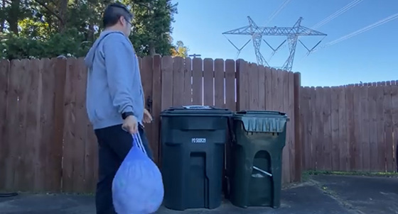
This isn’t a brog post if I chose to do the righteous option and solder forth with hoarding, and today I had to harden my heart as I took stacks of papers and drawings that my kids have done over the last year or so, and put them into the recycling bin. It kills my soul to do it in such a manner, but at the same time, my mental state goes to the shitter if my house’s state of cleanliness matches the chaos that is often in my brain, and when push comes to shove, if I can’t help myself from time to time, I’m no good to be able to help my kids and family.
My kids won’t notice, but I do, and I can’t help but feel wracked with guilt at the choice of my actions. Among these stacks were all sorts of drawings that were thought out, explained with exuberance, and in some cases, were probably drawings of our family, or their sister, or something else drawn with love and good intention, and here I am, the asshole dad who can’t stand clutter and chooses to toss them without record keeping, and the feeling absolutely sucks.
But again, as I’m so often reminded by so many people, sometimes I have to put myself first every now and then, and perhaps this is a reminder to myself that I should embark on my Instagram idea and use my chlidren’s artwork as a general basis for content, it might just help keep me accountable to be better about keeping record.

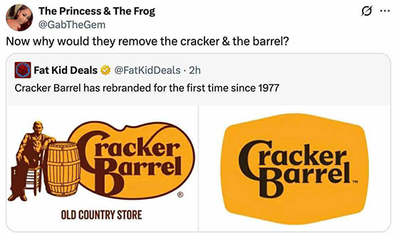
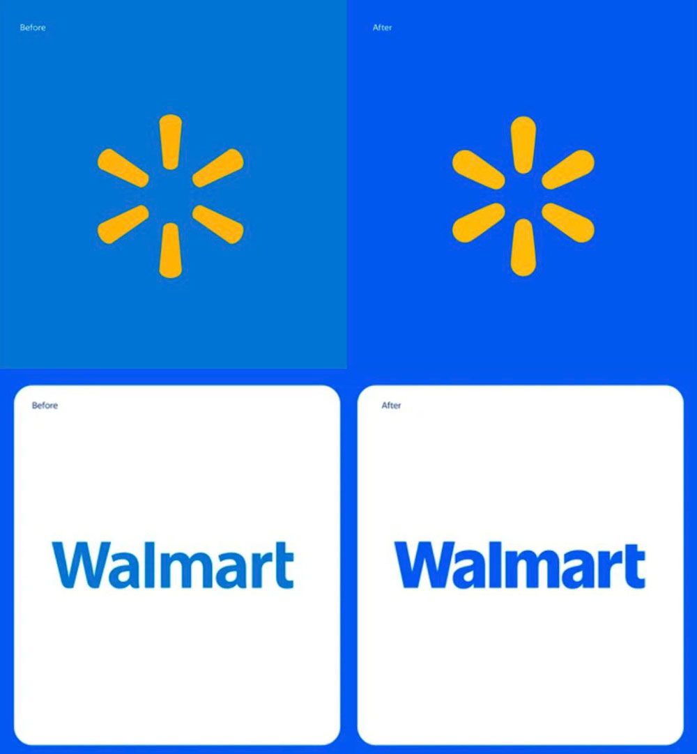
 Well, this is a prime example of why I, and other designers end up the way we do, is when we hear about the richest companies on the planet, dumping millions of dollars into rebranding efforts, that in this case are literally taking their old logo and adding 1-2 points of stroke around it, and then calling it rebrand.