
A drive into deep left field by Castellanos: Phillies outfielder Nick Castellanos on the chopping block, attempts to get in front of a story of how his fallout in Philadelphia began, including specifying an incident where after being benched, he brought a Presidente (beer) into the dugout while criticizing the manager
Despite the fact that he landed on the Phillies and always seemed to drink the Kool-Aid and be one of those dudes that absolutely murdered the Braves, I’ve always kind of liked Nick Castellanos. For all the silly reasons to like a player, like for many, it started with the whole meme of Castellanos blasting a home run in the middle of an announcer apologizing on air for making a homophobic remark, causing him to seamlessly segue out of his apology to report on the homer before easing right back into the apology.
But then it became apparent that there seemed to be this hilariously coincidental tendency for Nick Castellanos to crank home runs out at awkward moments of announcing, leading to the whole meme of Bad Timing Nick Castellanos, and that’s really all I needed for him to land in my general good graces.
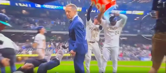
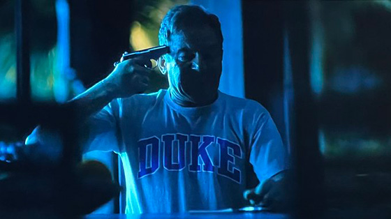
Anyway, as the story goes, in 2025, Nick Castellanos was pulled out of a game for lackadaisical effort, and he took so much offense to it, that, in his own admission, he had grabbed a beer out of the clubhouse and brought it back to the dugout where he was prepared to drink it in the middle of an active game while criticizing manager Rob Thomson’s leadership of the team.
This apparently fractured his position with the team, and with some dwindling performance, has made it really easy for the Phillies to want to cut him, despite the fact that they still owe him $20 million for the 2026 season, which they are responsible for, regardless of if he’s playing for the Phillies or not.
I’d love it if the Braves picked him up when the Phillies inevitably do release him, because he’d only cost the team $780K, with the Phils being on the hook for the remaining $19.25M, because he would provide some good depth for when inevitably Ronald Acuña, Jr. gets hurt again, and Castellanos could supply some power off the bench, but I wouldn’t bet money on the Braves getting him.
Regardless, anticipating some fallout for why the Phillies want to cut him so badly, Nick Castellanos took some time to hand write out a summary of the incident in Miami that seemed to be the beginning of the end for his time in Philadelphia, and as admirable it is that he wants to take accountability for his actions and control the narrative by admitting it first, one of the things that stuck out for me, was the oddly specific clarification that it wasn’t just any old beer he brought into the dugout to start criticizing Rob Thomson with, it was very specifically identified as a Presidente.
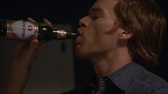
I’ve had Presidente beer before, several times in fact. There was one season of Dexter where just about every character was drinking it whenever there were any characters drinking beer, and the subliminal saturation of it did its job, and I grew curious about the brand, and when I happened to come across it, I didn’t hesitate to grab a sixer to see what all the fuss was about in Dexter.
It’s really not that great of a beer, but the connection to Dexter still made me like it. And also being the baseball nerd I really used to be, the fact that it was a Dominican beer made me feel some connection to all the Latin players that populated the majority of the MLB.
Needless to say, the mention and inadvertent plugging of Presidente by Castellanos opened up that curiosity from the past, and I’m tickled that he clearly must be a fan of the brew to the point where he had to be very specific at mentioning that it was a Presidente that he brought to the dugout.
The Presidente brand must also be pretty amused, or a little mortified that they got such a generous free plug, because the reality is that they probably haven’t gotten this much advertising since that season of Dexter. And because it’s coming from a player that I think positively of, it’s bringing that similar curiosity I had over ten years ago that if I were to come across a sixer or a forty of Presidente, I might have to pull the trigger.
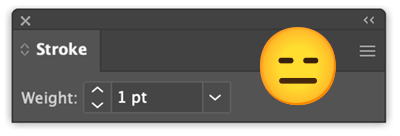 Well, this is a prime example of why I, and other designers end up the way we do, is when we hear about the richest companies on the planet, dumping millions of dollars into rebranding efforts, that in this case are literally taking their old logo and adding 1-2 points of stroke around it, and then calling it rebrand.