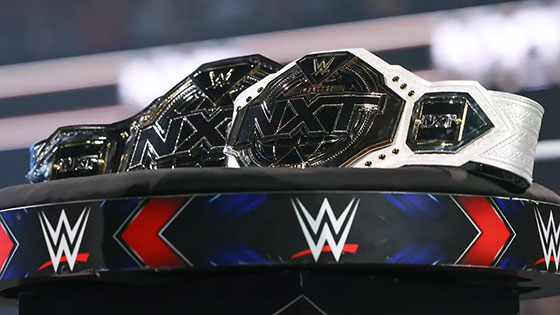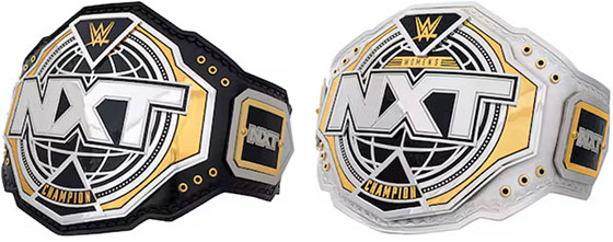
In case you missed it, as part of the show’s official launching on theCW Network, NXT has rebranded and as a part of the rebranding, have unveiled new and updated championship blets.
In one hand, this should’ve been predictable if I were to even think of the possibility of redesign, seeing as how for the last few years, through NXT 2.0, and whatever the gold logo’d variant after it was called, the title blets had remained almost entirely the same from their last versions from the Triple H black and gold branded NXT; most identifiable by the giant X’s in the middle of the logo on all titles in circulation.
But on the other hand, I’m very unimpressed by the new blet designs for their top men’s and women’s titles, and I can only imagine how vanilla and boring the tag team blets are going to be, and possibly the North American blets if they choose to redesign considering how little the NXT logos were on those.

Renderings of the blets outside of the shiny television lights don’t do them any favors, and you can see how generally lacking in thought and design there is behind the new blets. They’re regurgitating the straps from the black and gold era which is clearly dictating the design of the plates as a whole, and there’s really not a whole lot of innovation with these updated designs.
NXT grew to a point where NXT championship reigns were being widely accepted as world title reigns for superstars fortunate enough to get to that level, but with the blets looking like this, I’m thinking that they’re reverting back to looking like developmental champions rather than actual world title caliber.
Art nerd philosophy [one] is that fewer things are indicative of mediocrity than constantly rebranding and changing the aesthetics, because changes are only being made at a superficial level, and not necessarily to the more important functional and systemic ones. NXT 2.0 was a pretty comprehensive rebrand from top to bottom, all the way to execution, but it really wasn’t when 2.0 ended, and other than moving networks, I can’t really imagine what functional and systemic changes they have in store for theCW-NXT (CWNXT?).
But as observed above, they’d been operating NXT 2.0 with even older NXT title blets for so long, that by now a full comprehensive rebranding isn’t necessarily a bad idea either, it’s just that I don’t care much for the “design” of the identity or the blets themselves because of:
Art nerd philosophy [two] is that on a long enough timeline, everyone’s logo and identity seems to inevitably turn into one of being in Arial/Helvetica, specifically a variant of Helvetica Neue. There are countless examples out there of notable companies and corporations that have rebranded for almost no justifiable reasons, but always tend to take a timeless classic logo, and make an updated version where any script or character is stripped and is usually replaced by some boring, soulless, vanilla sans-serif font, usually wrapped in some rhombus.

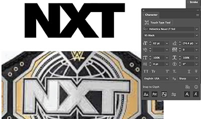
NXT is no exception to this rule, with the new logomark being literally the letters in Helvetica Neue 95 Black with a little bit of manual kerning to have the characters butt into each other, but is otherwise another example of a boring, vanilla and soulless rebranding.
Why companies are so hell bent to not go back to logos that worked is beyond me, Burger King has reverted back to an old iteration of their older logos, why can’t NXT go back in time and revert back to the Hunter-era of NXT’s branding? Then the blets wouldn’t have had to have been re-designed and recreated, but typing that out I’m reminded of the fact that the goal is to push and sell merchandise, so I supposed going back in time is kind of counterproductive to that objective.
Either way, even if I had the fluid disposable income to get more blets for the collection I can’t display, I have zero interest or desire to pick up a replica of this new CWNXT championship blet. My NXT collection is already well-represented with a Hunter-era NXT championship and North American championship, and I don’t see any need to add to it from a mediocre pool.
