
In one hand, I don’t throw this claim around lightly – I think that I can be picky about the things that I really like, and I’ve been told a bunch of times in my life that I’m a difficult person to impress, where it’s not necessarily intended to be that complimentary as much as it is an accusation of being excessively picky.
However, in the other hand, I don’t watch a tremendous amount of movies to where I’m remotely close to some wizened film expert whose opinion should be taken beyond a grain of salt, and I’d be the first person to disclaim such when explaining why I liked this movie, or any film that anyone wishes to discuss with me.
Anyway, The Substance: I do believe that it was one of the best movies I’ve seen in a long time, and it was one of those situations where I’m ¾ through the film and I’m just thinking about how interesting and enjoyable of a watching experience the whole thing had been, and coming to the conclusion that this really has been one of the better films I’ve seen in a long time.
It’s interesting too, because I recall this movie came out quite some time ago (2024), long enough to where I remember it being talked about on The Howard Stern Show, when I still had a SiriusXM preview active, since there’s a tremendous amount of skin shown in the film. But for people like me, if it’s not available on a streaming service, it might as well not exist, and just recently did it makes its way onto HBO Go Max Max, thus coming into official existence as far as I was concerned, and mythical wife went ahead and started up when we were at one of those weird crossroads where we didn’t want to start another show, and just wanted something singular and hopefully entertaining to be a pallet cleanser in between shows, and for me it was one of those welp, it’s started, time to watch it, experiences.
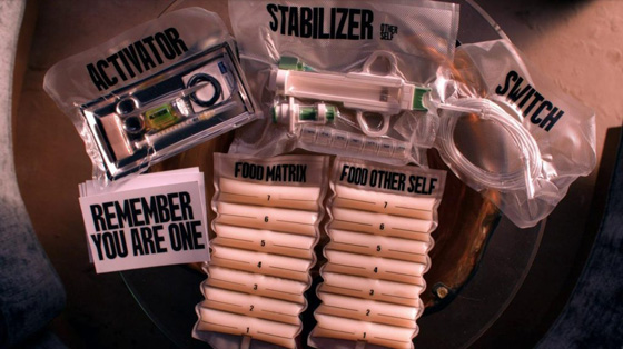
From start to finish, I found the film to be cinematographically wonderful, with lots of colorful and aesthetically stimulating shots and scenes, the art direction was inspiring and I loved the whole branding mission The Substance parent company embarked on with their dedication to branding everything they produced as far as packaging and messaging went. The score was catchy and I enjoyed the rhythmic techno beat that seemed to permeate throughout the whole film.
The word I’d use to best describe The Substance is “visceral” because man, do they not shy away from close-in macro shooting of anything from slovenly scarfing down shrimp cocktails, administering stitches, to all sorts of gruesome, gory, taboo acts that make people like me cringe and/or whip out my phone and try to look away instead of watching more.
And of course, the story was thought-provoking and poignant and if it makes me think about life, and what I’d do in such circumstances, then I think it’s a case of upper echelon storytelling.
The ending section of the film goes so off the rails and bonkers, that I have to imagine that it was probably a wildly entertaining sequence to have been present in a theater full of people when it occurred. And when it concludes, I was left having felt entertained, satisfied and in an overall good headspace because I had been entertained and inspired, and eager to sing the praises of the film for succeeding at all of the above.
I told mythical wife after we were done watching it, that I thought that this was probably the best movie I’d seen the whole year, and in the grand spectrum of things, it really was one of the better films that I’ve seen in a long time. I still think about it, and one of the biggest compliments I could give a film is that if I were to walk into a room and it were on, I’d watch it again without much complaint about needing to better utilize my limited free time and watch things that I hadn’t seen before.
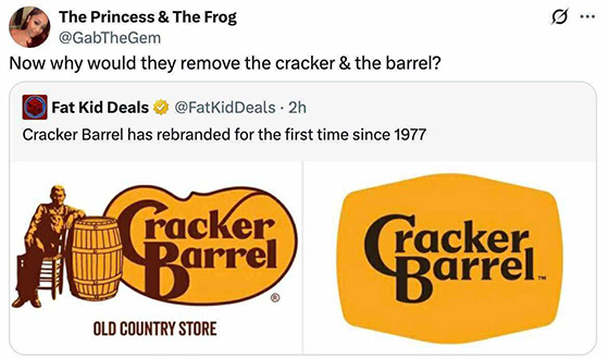
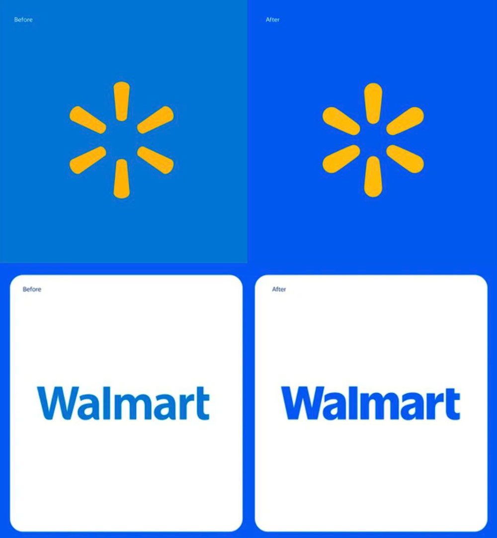
 Well, this is a prime example of why I, and other designers end up the way we do, is when we hear about the richest companies on the planet, dumping millions of dollars into rebranding efforts, that in this case are literally taking their old logo and adding 1-2 points of stroke around it, and then calling it rebrand.