This was never a matter of if, but when

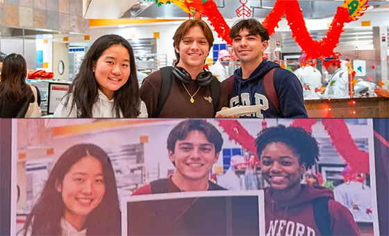
NYP: Stanford busted for using AI-altered student photograph for advertising, most notably swapping out Hispanic male for black female

If I’ve never put it in writing before, I’m a firm opponent of AI.  I think it serves a purpose for doing monotonous tasks that can save people a lot of time and efficiency, but obviously this was never the objective of the companies and individuals who are hellbent on advancing it, and it’s astounding how many people who work on AI seem blind to the notion that they are expediting the extinction of jobs and careers for people all across the world.

Will we see AI become sentient and ultimately take over the world, enslaving or terminating the human race, a la The Matrix or Terminator?  Probably not in our lifetime, but as all those stories have predicted, it really does seem inevitable that machines will eventually see human behavior as truly redundant and expendable, seeing as how machines are devoid of emotion and well, humanity.

For the time being, AI is primarily being used (publicly) to “inadvertently” kill my line of work, in the creative field, as hundreds of thousands of companies, businesses and individuals are churning out gojiggabytes of AI-generated “artwork” from shitty restaurant menus, billboards and signage, as well as a trillion memes and bad video edits.

Genuinely, I feel that my line of work does have an expiration date, and I have experienced multiple instances at my own job, where colleagues and collaborators have leveraged AI to haphazardly try and create rogue content, and having to be gently reminded that it’s not okay… as long as products shown aren’t necessarily from competitors.  And the faster that AI advances and lazier the uneducated and unethical become, the sooner people like me will be out of a job, forcing me to probably go into the trades and improve my life exponentially.

But anyway, this was a highly dramatic cold open to a post where I wanted to write about Stanford University getting busted using AI to create graphics, namely altering a photograph, where a poor Hispanic kid was swapped out for a black girl, presumably so that Stanford could look more diverse in advertising.

There’s a lot of different angles to approach this one, but most of it circulates around the notion that Stanford, being in northern California, simply does not have any diversity, being in Silicon Valley, so they’ve gotten to the point where they’re leveraging AI to make it look like there is, instead of, actually allowing some black students attend their hallowed institution.

But on the other hand, I’m a firm believer of merit, and that the best students should attend schools, regardless of race or gender or any other categorization.  Sure, Stanford is probably racist as fuck I mean come on, just look at them, and have as flagrant of a black people scale as big as they probably have an Asian scale, so it’s hilarious to me that instead of going out and actually recruiting some actual living black students to attend their school, they’re just using AI to pretend like they have some.

Frankly, as the subject of this post implies, this was never an if it would happen situation, it was always a when would it happen, and we’d all be blind and deaf if we believed that this was the first time that this had occurred, but the fact that an institution as reputable as Stanford was the one busted doing it is what makes it news right now.

Honestly, my reaction was similar to the victim of the shitty AI swap, at first glance, it is funny, but when you sit down and really give it some thought, it really is just sad and pitiful and actually malicious, that they’re not only deleting the actual humanity from a photograph, but replacing it with something artificial, false and completely dishonest.  Let’s not even get into the cosmetic modifications to the people that were allowed to stay in the photo.

When the day is over, Stanford, for all their academic praise and reputation globally, is no different than any other shitheads on the planet who are completely okay with the global takeover of AI.  It just sucks for all the Billy Ramirezes of the world who draw the short straw in photos that need to be modified to force in some artificial diversity by dishonest companies who are too chickenshit to accept actual diversity into their holy confines.

When changing the words make it sound less sketchy

I’m on the fence on whether or not I’m going to bother to try and game another temporary free subscription trial for SiriusXM upon hearing about how Howard Stern is changing his format yet again, dropping down to now just one show a week, along with the news that there have been a large number of layoffs within his camp, including some notable personalities that I’ve gotten to know throughout the years.  Change is inevitable, especially over a long period of time, Howard’s not getting any younger, and the finish line is inching ever closer, and without the King of All Media, I don’t see much point in indulging SiriusXM, even if I’m not paying for it.

That being said, when I feel the need for streaming music, I’m still an old head using Pandora, and much like most other streaming mediums, Pandora is no exception to being filled with gradually more ads, bringing their medium, one step closer to being no different than terrestrial radio.

One of the ads I’ve been hearing a lot of lately is for a sports betting service, because gambling available to everyone is totally not problematic in the world.  I’ve documented multiple times my lack of success in sports gambling and why I don’t imbibe in it anymore, and I should feel fortunate that I’ve taken such lessons to heart, because otherwise I’d probably be absolutely fucked in today’s world, where the persuasion to get into gambling is being inundated to the people like it were clean air and water.

The interesting thing about this particular ad is the boiler plate legal they blab out 1.75x speed at the end of the commercial about the dangerous risks of gambling, but the thing is how they’ve transformed the word “betting” into “predictions.”

The “prediction market” sounds a whole lot less scary than “sports betting,” as if one agency doesn’t have loan sharks, bookies and shady types behind it as much as the other does.  Also the prediction market doesn’t contain terminology that pigeon holes it solely to sports, because people can make predictions on all sorts of things that aren’t just sports, like betting on new Popes, what cities will land a large corporate client, what car manufacturer will release their new model next, etc, etc.

And therein lies the increasing dangers of the world of gambling, because the prediction market name has opened the door for all sorts of official betting on things outside of just sporting events.  I had no fucking clue to what was being advertised throughout the World Cup with all those weird Kalshi ads starring Timothee Chalamet but when I remembered at one point to actually Google the name, that’s when I learned that it was just a betting service but being called predictions.

I’m not above gambling by any means necessary, I’m just way more cautious with my money than I used to be, primarily on account of the fact that I have a family that depends on me continuing to make it, and not piss it away betting on shit like a real degenerate.  If I were younger and still unattached and uncommitted to anything would be a different story, but as a generally risk-averse person in nature, I probably would’ve been able to resist, but in this day and age where the masses are usually still like gambling = bad, but the market has like 100 different gambling services being advertised down our throats.

It’s just funny that in spite of the negative stigma that comes along with excessive gambling, a rebranding of the whole concept, simply by calling it ‘predictions’ seems to have reinvigorated the whole industry, and I predict that there are going to be some seriously broken families and people in the near to distant future, whose lives are going to be completely ruined by, predicting problems.

There are probably predictions on such metrics available on some prediction platform, for people to bet predict on.

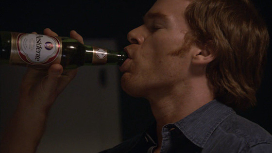
I love how the Nick Castellanos saga has given more exposure to Presidente beer since it was on Dexter

A drive into deep left field by Castellanos: Phillies outfielder Nick Castellanos on the chopping block, attempts to get in front of a story of how his fallout in Philadelphia began, including specifying an incident where after being benched, he brought a Presidente (beer) into the dugout while criticizing the manager

Despite the fact that he landed on the Phillies and always seemed to drink the Kool-Aid and be one of those dudes that absolutely murdered the Braves, I’ve always kind of liked Nick Castellanos.  For all the silly reasons to like a player, like for many, it started with the whole meme of Castellanos blasting a home run in the middle of an announcer apologizing on air for making a homophobic remark, causing him to seamlessly segue out of his apology to report on the homer before easing right back into the apology. 

But then it became apparent that there seemed to be this hilariously coincidental tendency for Nick Castellanos to crank home runs out at awkward moments of announcing, leading to the whole meme of Bad Timing Nick Castellanos, and that’s really all I needed for him to land in my general good graces.

Anyway, as the story goes, in 2025, Nick Castellanos was pulled out of a game for lackadaisical effort, and he took so much offense to it, that, in his own admission, he had grabbed a beer out of the clubhouse and brought it back to the dugout where he was prepared to drink it in the middle of an active game while criticizing manager Rob Thomson’s leadership of the team.

This apparently fractured his position with the team, and with some dwindling performance, has made it really easy for the Phillies to want to cut him, despite the fact that they still owe him $20 million for the 2026 season, which they are responsible for, regardless of if he’s playing for the Phillies or not.

I’d love it if the Braves picked him up when the Phillies inevitably do release him, because he’d only cost the team $780K, with the Phils being on the hook for the remaining $19.25M, because he would provide some good depth for when inevitably Ronald Acuña, Jr. gets hurt again, and Castellanos could supply some power off the bench, but I wouldn’t bet money on the Braves getting him.

Regardless, anticipating some fallout for why the Phillies want to cut him so badly, Nick Castellanos took some time to hand write out a summary of the incident in Miami that seemed to be the beginning of the end for his time in Philadelphia, and as admirable it is that he wants to take accountability for his actions and control the narrative by admitting it first, one of the things that stuck out for me, was the oddly specific clarification that it wasn’t just any old beer he brought into the dugout to start criticizing Rob Thomson with, it was very specifically identified as a Presidente.              

I’ve had Presidente beer before, several times in fact.  There was one season of Dexter where just about every character was drinking it whenever there were any characters drinking beer, and the subliminal saturation of it did its job, and I grew curious about the brand, and when I happened to come across it, I didn’t hesitate to grab a sixer to see what all the fuss was about in Dexter.

It’s really not that great of a beer, but the connection to Dexter still made me like it.  And also being the baseball nerd I really used to be, the fact that it was a Dominican beer made me feel some connection to all the Latin players that populated the majority of the MLB.

Needless to say, the mention and inadvertent plugging of Presidente by Castellanos opened up that curiosity from the past, and I’m tickled that he clearly must be a fan of the brew to the point where he had to be very specific at mentioning that it was a Presidente that he brought to the dugout.

The Presidente brand must also be pretty amused, or a little mortified that they got such a generous free plug, because the reality is that they probably haven’t gotten this much advertising since that season of Dexter.  And because it’s coming from a player that I think positively of, it’s bringing that similar curiosity I had over ten years ago that if I were to come across a sixer or a forty of Presidente, I might have to pull the trigger.

So many easy jokes about the Mariners repping Nintendo

LL: Seattle Mariners agree to wear Nintendo Switch 2 patch for the 2025 MLB season

I don’t care enough to dig deep into the finer details, but Nintendo doesn’t own the Mariners like they once did, but they have enough pull with the baseball organization to ensure that throughout the 2025 baseball season, the Mariners will have a sponsorship patch on their away uniforms for the Nintendo Switch 2.  Their home whites will have a regular old Nintendo word mark logo on those alternatively.

Regardless, the jokes write themselves about a company like Nintendo being the uniform sponsor for a baseball organization like the Mariners, because in more ways than one, they operate in similar manners.  Now such could be as the result of the once ownership and the influence Nintendo clearly still has within the Seattle Mariners organization, or maybe they really are two peas in a pod in how their business philosophies are concerned, but the fact of the matter is that there really is a lot in common between both companies.

Nintendo is notoriously Japanese, as in that they are more than happy to operate in a completely risk-averse, efficient manner that prioritizes a zero-waste mentality.  For example, despite the fact that a billion people on the planet wanted the Wii when it first came out, they were all like ehhhh, let’s make just 20 million units, can’t possibly risk there being some false demand and us being stuck with extra units and being forced to sell at a discount.  And for the next several years, nobody could get their hands on one, and they were selling on the resale market at insane markups, and by the time demand was truly fulfilled, the Wii 2 was knocking on the door, and the process kind of repeated itself. The point is, Nintendo prioritizes efficiency and avoiding all risk over possibly making consumers happy and meeting demand a lot closer in which they operate to this day. 

And the Mariners are kind of the same way, because they just, always kind of suck as an MLB franchise, and no matter how much the market changes, how much talent they luck into from their system, and the availability of free agents throughout the years, the organization just somehow manages to always suck at winning baseball games, and much like Nintendo, letting consumers down by taking no risks, avoiding any possibility of dead money by signing no free agents, and routinely letting their fans down on a yearly basis.

It’s funny, because I actually wrote about the Mariners not too long ago and how it’s pretty incredible how much they’ve sucked historically.  Because this is an organization that has had the likes of Ken Griffey, Jr., Randy Johnson, Ichiro Suzuki, Alex Rodriguez, Edgar Martinez and a prime Robinson Cano, and in some cases, an overlap of some of these talents. Yet they never won anything, beyond the magical 2001 season where they won 116 games, before crashing out unceremoniously in the playoffs to the Yankees.  They rarely saw the playoffs, didn’t do much once they got there, and no matter the talent that has been on the squad, they just, well suck.

Just recently, the Mariners successfully signed their catcher Cal Raleigh, to an insanely team-friendly deal, six years at just $105M.  The guy is an average 4 WAR player, not even hitting his prime, and could easily have been worth double of this, in just a few years.  But he clearly likes something in Seattle and has agreed to stay there, but the real question is if the Nintendo Mariners will actually do something with this centerpiece, or if it will just be more of the same, operating like Nintendo, where they will only produce the absolute bare minimum in order to be relevant, but absolutely nothing more in order to even attempt to be anything but afloat.

It’s really a chicken and egg situation on whether the Seattle Mariners are operating like Nintendo, or if Nintendo is operating like the Seattle Mariners; but if I’m a betting man, I’d say the former, but either way, neither is a particularly enviable position to be in, because jaded video gamers all resent Nintendo for their Nintendo-ey business practices, and Mariners fans all resent the Mariners for simply never really trying, so ultimately, this sponsorship marriage seems to be a very fitting fit for both parties involved.

Imagine being so insecure of your masculinity that you need to get a MANLY BAND

I don’t know what it says about my browsing habits and the conversations that big brother is listening to, but I got this ad for some company called MANLY BANDS and it’s apparent that they’re in the business of making MANLY rings for the MANLIEST of MEN to wear to physically indicate their marital status.

They appear to be available in names like THE COWBOY, and based on the one photo they have, they appear to have wood as one of the materials in which they’re made, looking like a squashed barrel that Donkey Kong sat on instead of throwing at Mario.  Apparently instead of some pussy jeweler’s ring box, they’re packaged in TACTICAL BOXES, because nothing is MANLIER than presenting shit inside of a tactical box instead of something made of lesser, more pussier material.

I love how their logo is crisscrossed fire axes, a campfire and a tree, to hit that this is what a MANLY BAND is made out of, and of course their choice of font is IMPACT, because this whole thing is just so absurdly ridiculous, it may as well be a meme.

Oh, and I’m definitely not going to ignore the very obvious MANLY BAND customer looking like how he’s got his bride in a chokehold in order to kiss her, because he probably sees her as property after saying ‘I do’ and is wasting no time at imposing his will and possession over her.

And come on, bro can’t even take off his fucking Apple watch for his wedding?  I like the convenience of being able to check the time at any given moment, but even I took my fitness tracker off when I got married.

I remember when I was looking for a wedding band before I got married.  I initially thought I wanted something different than a traditional sterling or gold or white gold band, and I imagined myself getting something like a carbon fiber band or something different, not necessarily to be MANLY, but just for a change of things.

I tried on some carbon fiber rings and things that weren’t so traditional, but frankly they all looked too dark and ridiculous for my taste.  Ultimately, I went with a tantalum band that definitely leaned more traditional, but at the same time was slightly darker than a shiny band, and I like the general indestructible nature of it in order to get a degree of uniqueness that I’m satisfied with.

But never did it once cross my mind that there would be the possibility of giving off the perception of becoming less MANLY if I picked a questionable wedding band.  So going back to the title of this post, imagine being so insecure with your masculinity that you feel the need to acquire a MANLY BAND as a wedding ring.  Maybe the aesthetics are more these bros’ style, but for me, anything with wood is a no-go.  Last thing I’d want from my ring is for it to get beat up like mine sometimes does, and then it starts to rot because that’s what wood tends to do.

Either way, chalk MANLY BANDS as one of the dumber things to have come into existence in recent years.  I think I’d put them up with drinking cups made out of baseball bats, but unlike those, I wouldn’t wager a sacrificial bet in order to get the Braves to win a World Series for a MANLY BAND.

I am in the wrong segment of this industry

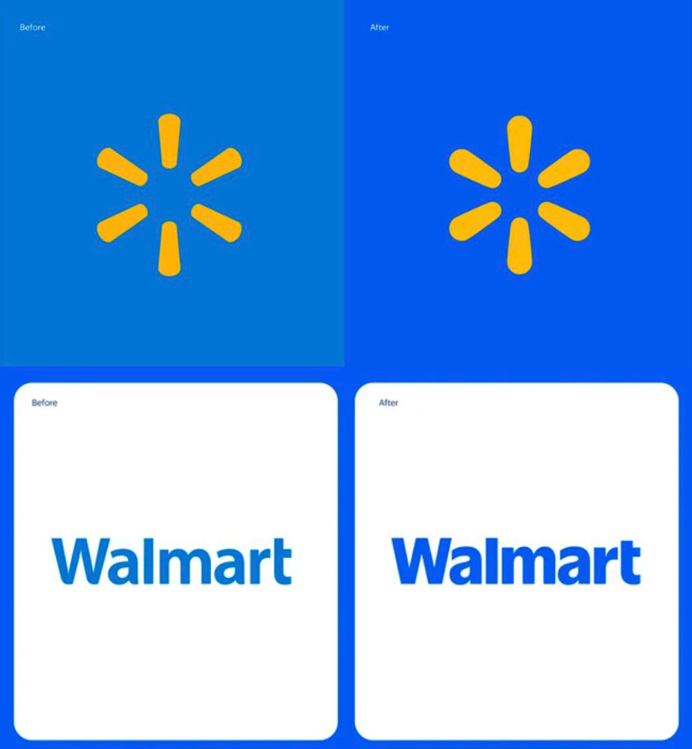
Forbes: Walmart “rebrands” for the first time in nearly 20 years, response is predictable but justifiable

Often times I get pegged of being jaded or pessimistic about the design industry.  Why are you in it then?  If you don’t like it, do something else with your life.  And so on, and so on.

Well, this is a prime example of why I, and other designers end up the way we do, is when we hear about the richest companies on the planet, dumping millions of dollars into rebranding efforts, that in this case are literally taking their old logo and adding 1-2 points of stroke around it, and then calling it rebrand.

By the way, this Sisyphus-ian effort cost $1.25 million dollars.

Honestly, in the history of rebrands, $1.25M isn’t the worst or highest dollar amount sunk into one, but considering the sheer lack of effort that went into this, it’s still pretty noteworthy, and undoubtedly chalks up to be a classic example of egregious corporate waste of money.

For years, I’ve always called the Walmart star “the butthole” because let’s be real here, it basically looked like a little yellow sphincter, and I figured it was apropos that they did that, considering the sheer amounts of fucking they did to the market, economy and small business.  Also, I personally think Walmart sucks ass as a whole, so there’s that association too.

I don’t really know or can fathom why Walmart felt the need to rebrand in the first place, but I guess if those in the world of business feel  if you’re not constantly evolving, you’re dying, shit like redundant, unnecessary and minimal effort rebrands gets accusatory eyes off your nuts for a minute and makes it look like they’re doing something, other than fucking the world of commerce and getting a bunch of old white men richer by the hour.

Seriously though, there’s really not as much to rant about as I felt there could’ve been; that’s just how little effort that Walmart put into this rebrand.  They literally just pressed increase stroke around both the butthole as well as the wordmark, and the end result is a bolder wordmark, and a butthole that has appeared to have gotten a little more clenched.

There’s an easy joke about the shitshow that 2025 and beyond seems like it’s going to be, leading to clenched anoos-es throughout ‘Murica, but I don’t get the impression that Walmart as a company isn’t necessarily in opposition to the parties that might be leading to these tighter assholes, so I don’t think it really works.

Perhaps it’s more representative to how the company is a bunch of tightwad fucks who sinch and clench and choke out small businesses throughout the world, squeezing all the way to their assholes, which is ultimately what the butthole represents.

Either way, I don’t shop there, and I actively go out of my way to typically avoid them when I can.  I like protecting my butthole literally and metaphorically, and don’t wish to support companies that go out their way to raze the buttholes of the people; as well as put out shitty creative and branding.

Jaguar’s new logo = Publix Supermarkets

Trent Crimm, The Independent: Jaguar unveils new branding and logo and the crowd goes mild but eventually more into ire

I don’t particularly care much for Jaguar as far as cars go, they’ve always been a little pretentious and overrated as far as my tastes are concerned, but I also wouldn’t put them in the category of cars that I wouldn’t ever get if I had the means necessary.  Their aesthetics aren’t really my cup of tea, but I can like what I see on a paper when it comes to performance specs.

That being said, put me in the camp of people whose interest in the car company most definitely trended downward upon seeing their rebranding.  Jaguar becoming JaGUar, with this absolute masterclass of horseshit spinning from their corresponding press release:

seamlessly blended upper and lower case characters in visual harmony”

Nah, of course it’s not as cerebral as that.  The designer, and I use that term loosely, didn’t like the way the lowercase G looked and didn’t like the extra stroke that the lower case U had and went with upper case variants which looked more seamless; and then the right VPs, with their wealth of artistic credibility, happened to like the way it looked, gave it the green light, and away we go.

Looking at it made me immediately think about Publix Supermarkets’ logo and possibly the Beats by Dre identity,* but mostly Publix, and it always amazes me when the brand designers of the world don’t really take any time to research the logos of the world and take a modicum of effort to not look like someone else’s identity.  Because then rogue designers like me can’t clown on them and make the easy swap of logo into what they really look like, and if I’m someone with any clout, or at least tempted to try and engage Publix on social media and post this graphic just to see their reaction.

*also there’s this regional adult store chain that also utilizes a similar typeface that I always see billboards for while driving to Disney World that is somewhat related to the jaguar animal kekeke

All the same, it’s kind of sad.  I might not have been that high on Jaguar as a brand, but their identity was pretty unmistakable, with the silhouette of the jaguar leaping over a fairly nondescript bold all-caps wordmark.  But there’s this overarching cry in the design community, that modern branding is all metamorphosizing into a very diluted pool of vanilla “safe” logos that are all looking the same and homogenized into these blobs of non-personality.  Serifs and symbols have become enemies, variations of Helvetica Neue and Gotham are overtaking visual identities everywhere, and with JaGUar’s rebranding, another long-standing reputable brand has deliberately chosen to converge with the masses and adopt a boring, vanilla, forgettable identity, once the initial reactions and internet ridicule all die down.

That being said, I think it’s only a matter of time before JaGUar releases some turd on wheels that’s a hybrid crossover CUV that looks just like a Corolla Cross or a Buick Encore, and then we will truly know that JaGUar has really given up on trying to compete in the market as much as they’re just trying to blend in and hide in plain sight.

I mean with a logo that looks like this, they’re already halfway there.