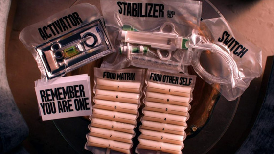
The Substance was one of the best movies I’ve seen in a long time

In one hand, I don’t throw this claim around lightly – I think that I can be picky about the things that I really like, and I’ve been told a bunch of times in my life that I’m a difficult person to impress, where it’s not necessarily intended to be that complimentary as much as it is an accusation of being excessively picky.

However, in the other hand, I don’t watch a tremendous amount of movies to where I’m remotely close to some wizened film expert whose opinion should be taken beyond a grain of salt, and I’d be the first person to disclaim such when explaining why I liked this movie, or any film that anyone wishes to discuss with me.

Anyway, The Substance: I do believe that it was one of the best movies I’ve seen in a long time, and it was one of those situations where I’m ¾ through the film and I’m just thinking about how interesting and enjoyable of a watching experience the whole thing had been, and coming to the conclusion that this really has been one of the better films I’ve seen in a long time.

It’s interesting too, because I recall this movie came out quite some time ago (2024), long enough to where I remember it being talked about on The Howard Stern Show, when I still had a SiriusXM preview active,  since there’s a tremendous amount of skin shown in the film.  But for people like me, if it’s not available on a streaming service, it might as well not exist, and just recently did it makes its way onto HBO Go Max Max, thus coming into official existence as far as I was concerned, and mythical wife went ahead and started up when we were at one of those weird crossroads where we didn’t want to start another show, and just wanted something singular and hopefully entertaining to be a pallet cleanser in between shows, and for me it was one of those welp, it’s started, time to watch it, experiences.

From start to finish, I found the film to be cinematographically wonderful, with lots of colorful and aesthetically stimulating shots and scenes, the art direction was inspiring and I loved the whole branding mission The Substance parent company embarked on with their dedication to branding everything they produced as far as packaging and messaging went.  The score was catchy and I enjoyed the rhythmic techno beat that seemed to permeate throughout the whole film.

The word I’d use to best describe The Substance is “visceral” because man, do they not shy away from close-in macro shooting of anything from slovenly scarfing down shrimp cocktails, administering stitches, to all sorts of gruesome, gory, taboo acts that make people like me cringe and/or whip out my phone and try to look away instead of watching more.

And of course, the story was thought-provoking and poignant and if it makes me think about life, and what I’d do in such circumstances, then I think it’s a case of upper echelon storytelling.

The ending section of the film goes so off the rails and bonkers, that I have to imagine that it was probably a wildly entertaining sequence to have been present in a theater full of people when it occurred.  And when it concludes, I was left having felt entertained, satisfied and in an overall good headspace because I had been entertained and inspired, and eager to sing the praises of the film for succeeding at all of the above.

I told mythical wife after we were done watching it, that I thought that this was probably the best movie I’d seen the whole year, and in the grand spectrum of things, it really was one of the better films that I’ve seen in a long time.  I still think about it, and one of the biggest compliments I could give a film is that if I were to walk into a room and it were on, I’d watch it again without much complaint about needing to better utilize my limited free time and watch things that I hadn’t seen before.

Let’s talk about the WWE’s new tag blets

In one of those I should’ve seen it coming but I didn’t, the WWE has recently redesigned and unveiled new tag team championship blet designs.  Over the last few years, almost all the blets have been systematically been redesigned from top to bottom, except for the tag blets, which were still red for RAW and blue for Smackdown. 

Blets being in the middle of a reign didn’t seem to matter for when to unveil new designs, as Roman Reigns, Asuka and Rhea Ripley all received the new versions of the blets that they had held, but for whatever reasons, the Usos having the combined tag team championships on lockdown didn’t warrant swapping of those designs, but seeing as they were broken up and sent off to different shows seemed as good as time as any for the E to finally unveil new titles.

When the new World Tag Team Championships were unveiled on RAW, one I was happy for the Miz and R-Truth, two WWE lifers who are the consummate pros who do anything and everything they are asked for, do it well, and always manage to get absolutely anything over.  But two, my knee-jerk reaction to these blets were that I was relieved to see that they were finally gold blets again, seeing as how fewer things made the tag titles feel lesser-tier over the last 10+ years than the fact that they were bronze and then silver plates.

The shade of gold, amount of flourish and the weird griffin chimaera creatures made me think that this perhaps could’ve been a previous version or option of the World Heavyweight championship blet that ultimately ended up looking like a spin-off of the old WCW big gold blet in terms of its general shape and composition.

But overall, I do really like the new World Tag Team blets, except for one thing – the font they used on it.  Not digging the spiky, Glaive-like typeface they used, and it looks like they’re trying to be a 2005 RAW graphic package with it.  Furthermore, the type is just too fucking large, and much like my general aesthetic preference when it comes to clothing, I think when apparel requires too much text to explain it, then it’s design that is not optimal.

If the fonts were smaller, I could overlook the undesirable typeface selection, but overall, I’m pleased with the way the new World tag blets look.  Not sure if I’d want to own one, but typically a really good discount has gotten me possession of other blets I’ve felt similarly about.

Obviously, once RAW had unveiled new tag blets, among the first thoughts I had was pondering what Smackdown was going to do, because it was obvious that they were going to get a redesign as well.  But the question was, was it going to be carbon copies of the RAW titles, but with blue paint behind the globe and type?  Or was it going to be something completely independent?

Fortunately, the answer was just days away, when Smackdown unveiled the WWE Tag Team championships, with blets that looked completely different from their RAW counterparts.  Immediately, my eyes noticed the familiar shape of the center plate, which was an obvious throwback to older tag team blet designs, that had what I like to jokingly call the nutsack shape, because for whatever reason, the bottom has two bulges like a pair of testicles.

Regardless of the homoerotic comparison, my knee-jerk reaction was still positive.  I liked that it was a completely different design, and this will prevent any future embarrassing title swaps in future draft storylines.  It’s general design is much more muted and subdued than the World tag blets with its design being more etched and not molded.  In doing so, it does look like a cheaper blet in comparison, but as far as design goes, it’s a preferable design over its counterpart.

The font treatment is much more subdued and exactly how I prefer it, and the throwback shape of it is pretty much all that it needs to have to be the preferable of blets between the two.

What it all boils down to is if I had to pick one, which would I go with, and that would be the Smackdown WWE Tag Team blets.  The homage to the classic design is fantastic, and even though the World is the more detailed and nicer looking blet, the font is a turn-off for me

Either way, I’m glad to see that the E has redesigned both, because in the future when the tag blets are used as a prop or a means to reward two mildly over singles guys, at least they’ll look good holding some actual gold straps instead of silver-plated toy-looking blets.

Praise for TNA’s blet refresh

Initially, I wasn’t really keen on Impact Wrestling re-branding back to TNA.  There was just this bush league reputation of TNA that always stuck with me that involved Jarretts, Dixie Carter, strange booking, Cups for no prizes, convoluted booking, the six-sided ring and a drunk Jeff Hardy that I didn’t think was a good idea to going back towards.  I always felt that Impact was a respectable endeavor of scaling back, restructuring, reinventing, and growing back towards respectability.

Especially compared to the questionable things that AEW does, I found Impact to be the more refreshing alternative to the predictability of the WWE, and over the years, I’ve always made a point to hit up Impact when they stopped in Atlanta, and even liked their product so much, it inspired me to get an Impact replica blet, as bootleg Pakistani as it undoubtedly was.  I enjoyed what they were doing, and I respected the fact that they weren’t necessarily trying to compete with the Joneses and were out there, as a solid #3 promotion, doing their thing, letting people work, and putting out decent product.

But I kind of get it why they wanted to go back; probably if for anything, because all of the noteworthy promotions in the land are all three-letter acronyms, and being “and Impact” might’ve felt like being way too much of an outlier.  WWE, AEW, ROH, NWA, GCW, PWG… and Impact.  Perhaps there’s just something about three letters that means wrestling, and just like that, TNA is back, and the Impact name reverts to being the flagship television show.

Regardless, if there was one fun thing to come out of the rebrand was the inevitability that there would be new blets, because Impact blets sure as heck weren’t going to fly in the land of TNA.  And I have to say, despite my reluctance to accept the TNA name back into existence, as far as their refreshed lineup of blets across the promotion, I have really nothing but praise.

They did the smart thing, and refreshed them all at the same time, so they can have something of a cohesive and uniform look to them.  Not like when the WWE updates the US title in 2020, the Intercontinental blet in 2021, a 24/7 title that came and went in the blink of an eye.  I didn’t know who ZBro’s Belts was, but after seeing how great these TNA blets came out, I dug to find out who the maker was.

I appreciate that there’s both cohesion as well as variation with all the blets, and they don’t all look like the same fucking blet like Ring of Honor’s entire lineup of titles look after Tony Khan bought them.  Gold for men and women’s top prizes, red straps for the tag blets.  The X Division blet has come leaps and bounds from when it was basically just a big red X on a blet, and looks like a solid #2 prize, and I know it gets a lot of criticism mostly for its name, but I really dig the updated Digital Media blet.  I love how it has kind of a circuitboard pattern in the background, and there was obvious thought that went into its design as opposed to copying bits and pieces from Japan and UK to create a bunch of AEW midcard titles.

As for the inevitable question on whether or not I’d entertaining getting any replicas should they be available, legitimately or though Pakistan, there’s always the possibility for the right price.  I’d honestly go for a Digital Media championship first, and if I ever had the disposable income, even go after a set of the Knockouts Tag Team blets for my girls, especially since these don’t have the goofy-ass Garfield Copper font on them like the old ones did.  The others, would be dependent on if any workers appear to be doing good enough work to inspire me to want to get one, and if Nic Nemeth captures the world title, it just might be enough to get the job done.

This should mean war

I heard from one of my new colleagues about this, and I had to google it to try and see with my own eyes, because I hardly leave my house in the first place.  Fortunately, photo evidence of it exists, and yeah, it’s everything that was described to me, and I’m pretty much in awe.

Basically, Bojangles has decided that they give no fucks about copyright or decorum, and has erected this giant billboard off of I-75 that flagrantly uses lightly modified versions of the Chick Fil-A mascot cows as well as the Chick Fil-A typeface, in order to push awareness of their supposed new chicken sandwich. 

Which is funny to me, considering I would’ve figured they’ve had one for the last three decades, considering they’re a chicken joint, and they could just as easily take the slabs of chicken used in the cajun filet biscuits that I get exclusively, slap them in between an actual bun with some sauce and pickles, and call it a signature sandwich.  Or maybe they have, and are just releasing something a little in competition to all the other chicken joints’ signature chicken sandwiches, who really knows.

Anyway, this is somewhat notable considering Atlanta is the home of Chick Fil-A, so Bojangles marching into the metro area and propping up a billboard like this really should be a declaration of war to some degree.  But as entertaining as it would be to see an actual war brew between fast food chicken joints, we obviously won’t see anything as flagrant as this in rebuttal, unfortunately.  And Bojangles probably knows that, which is why they did it, because to the public eye, a shot like this that goes unanswered, is a point for them.

Either way, I hold no ill will towards either company, and I enjoy their products both.  Bo’s biscuits on Sunday mornings is practically a tradition in my household, which is the perfect thing to fill the void when Chick Fil-A is closed.  But Chick Fil-A’s app is the gold standard in which all fast food joints should aspire to be, and a large reason of why I go there as often as I do, as it saves me time and aggravation, two things that are in short order when living the life I do these days, all while amassing reward points for more free shit.

But make no mistake, as far as public score keeping goes, this is a huge point for Bojangles in the supposed Restaurant Chicken Wars™.  It would be nice to see CFA respond, but everyone knows they probably won’t.  At least not in Georgia.  It would be fun to see if they drop some cheeky billboards out in Charlotte, if they already haven’t.

Pleased AF

Often times, upon completion of presentation of a project, I wait a little bit afterward and then look at it again, to see whether or not I hate it yet.  So many times in my life I’ve made something, been very pleased with it, but then 1-2 days later I’ll look at it again but instead be completely disgusted with the things I create.  Regardless of what people might think or say about the things I make, when the day is over I am my very own worst critic and the true litmus test on whether or not I decide something I’ve created is satisfactory depends primarily on how I feel about it a little after it’s been out in the world.

Technically speaking, I am the creator of Arby’s Saucy_AF typeface they’ve released, as part of their marketing juggernaut team that I can proudly say that I know several members of.  I’m not the one who made the intricate characters out of sauce, nor was the person who photographed them, but I am the designer who vector outlined everything, and turned said artwork into a fully-functional typeface.  If I knew how to find out how to view the credits of a typeface, I’d totally show off the screengrab my name in them, but for now I’ll just have to settle with the private satisfaction of knowing that this is my work, and that I can also proudly say that I got to legitimately be a contributor to the Arby’s marketing team that is the envy and a shining star of marketing creative throughout the industry.

Few things are more satisfying than working with people you know you work well with and producing creative that I can be proud to say that I had a hand in.

Continue reading “Pleased AF”

If this is what constitutes acceptable design, I need to change careers

what the fuck is this shit

Were the exact words that my brain said when I looked at the new Creative Loafing Atlanta website.

I thought maybe the site had been hacked or something, and whatever Russian or Chinese hacking organization was deliberately using a 4-bit retro Oregon Trail looking interface as their ransom page demanding some Bitcoins in exchange for control over their website again, but after a few minutes, not seconds, of figuring out how the new navigation worked, it was pretty much confirmed that this was in fact, the new Creative Loafing Atlanta.

To cut to the chase, this is basically the worst redesign that I’ve ever seen in my entire life.  It’s worse than when Pepsi tried to use the Golden Ratio and the Vitruvian Man to explain their logo, which was pretty bad considering it literally cost Pepsi $1.4 million dollars for a PowerPoint so inflated with bullshit that it could have incinerated Palo Alto if it caught on fire.  But that’s just a logo, on a line of products that lots of people otherwise enjoy to indulge in regardless of what logo was slapped onto the bottles.

Creative Loafing Atlanta was already a publication in more or less rag status, and they’re an entity that can’t really afford to fuck up on design when whether people admit it or not, love to judge books by their covers.  And yet, here we stand, with a website that looks like an unintentional glitch, or your monitor fell face first and when you propped it back up, pixels are dead and busted, resulting in the horrific interface that currently loads.

Continue reading “If this is what constitutes acceptable design, I need to change careers”

Guitar Hero: The Next Generation

I saw a commercial for the new Guitar Hero game, and when the logo flashed on screen at the end of the spot, I couldn’t help but think that I’ve seen this logo before.  Upon looking at the logo some more, it dawned on me that it was basically the same font as the JJ Abrams rebooted Star Trek franchise’s logo.

Granted, upon putting them directly next to one another for direct comparison reveals that they’re not 100% identical, but at first blush, my designer’s eye is basically seeing “the Star Trek font” when I see the new Guitar Hero’s logo.

For all intents and purposes, Star Trek’s typeface is probably derived from an existing font, with slight modifications made to it to (attempt to) make it their own, but as far back as I can recollect, Star Trek did come first, therefore, I immediately associate it to them when I see any instance of a similar font being used.

Continue reading “Guitar Hero: The Next Generation”