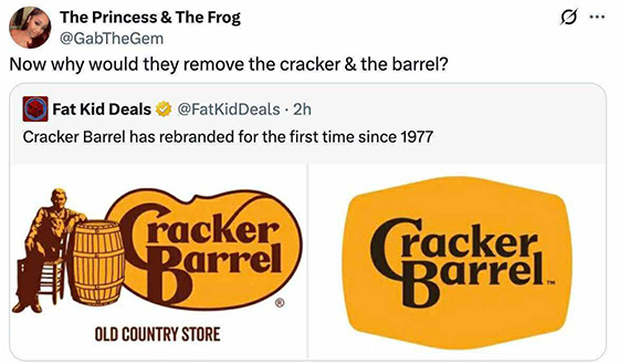
USA Today: Cracker Barrel unveils a new logo; the internet is unsurprisingly not impressed
When the day is over, I have no skin in the game of the existence of Cracker Barrel. Full disclosure, I haven’t been to a Cracker Barrel since I lived on the south side of the city, when they opened a brand new Cracker Barrel not far (relatively) from my old place, and upon going there, all the big wigs and managers and trainers were there, so everyone was on their best behavior and it was actually a decent experience.
But no matter if people hate the new logo or people love it, I’m not going to lose any sleep over it one way or the other, and can only really share opinions and thoughts based on the creative direction of it, as well as relish in some of the less tasteful jokes that the internet is particularly known for generating about anything and everything in existence.
But my first blush impression and my knee-jerk reaction upon seeing the new Cracker Barrel logo was that of unsurprise at the fact that they removed both the man and the barrel, and have homogenized it down to an uninspired shape. However, I am surprised at the fact that they did manage to keep the general wordmark of the text mostly intact, instead of just typing out “cracker barrel” in a variation of Helvetica Neue or Myriad, like so many companies inevitably do, as if they’re determined to not pay anyone for a font, and are completely at peace with just writing it out in system default fonts.
So it’s kind of a push in the sense that they did murder all the character and uniqueness of the logo by removing both the man and the barrel, as well as the unsymmetrical shape in which the wordmark was housed, but still managed to preserve some sense of character, familiarity and recognition by at least keeping the wordmark mostly the same.
A hexagon with rounded corners isn’t a vanilla rhombus or oval like so many brands have boiled down to in this modern business space, and at least they appear to have kept their primary color intact; however, it appears they’ve cheapened up by swapping out their brown for a black, thus making future production simplified in that they technically only need one additional color outside of black and white.
Honestly, the container looks a little too large for the wordmark, and in the event like creating signage and advertising materials, the general proportion of it compared to the Cracker Barrel name is might end up looking comical, or lead to some comically large signs in order to compensate.
But like I said, when the day is over, I do not care one iota about this rebrand, beyond the obvious joke that was made in the shown screen grab – why DID they get rid of both the cracker and the barrel?? Considering the brand is kind of synonymous for being a white people eatery, not entirely sure why they’d go to the lengths of alienating them by removing paw-paw from the logo, but whatever. As far a corporate rebrands go, this one is far from the worst, and it’s not going to suddenly make me want to deal with the shitty parking situations enough to want to actually go to a Cracker Barrel again any time soon.
