I don’t dislike DC Comics, but I’m definitely one of those fans that feels like no matter what they do, no matter what they try, it always seems like it falls flat, and when they’re inevitably compared to Marvel, they’re always this extraordinary distant second place. I love Batman, and I have no qualms with really any other DC property, but in my opinion, I just feel like DC in particular has fallen a little too victim to the changing of the times and ideals of the world, and have been way too quick to pull the plug on long-term storytelling, and retconned things so rapidly and so frequently that it’s hard to even tell what’s canon versus what’s just some blow-off one-off.
It’s like the comic industry is truly no different than the rest of the working world in that nobody stays put long enough to see through any chances at some good long-term storytelling or even just a year’s worth of comics these days, and the industry as a whole is full of convoluted, clunky crap that I have little interest in reading on the monthly, and prefer to read about it later on Wikipedia synopses, so that I can then go, what the fuck?
Anyway, in yet another reconning of the universe, DC Comics is apparently going in the route called the Absolute universe, which I’m guessing is a lot like when Marvel launched the Ultimate universe, but the fact of the matter is that it’s still a hard reset of all the flagship properties, with hopes of boosting sales, engaging the newer, even more ADD generation, and that it’s easier to start over from scratch versus even attempting to pick up the pieces from the latest wave of employee turnover.
And part of the entire reconning of the company, for some reason, they saw fit to redesign a bunch of logos of notable properties. And if there’s one thing I’ve learned throughout my career as a creative, fewer things (attempt to) mask mediocrity than the changing of logos of a notable brand(s), or making them in the first place, for inconsequential purposes. I mean, the City of Atlanta probably burns $10M a year on making logos and branding stupid bullshit while half of that is probably skimmed into the pockets of corrupt bureaucrats to begin with.
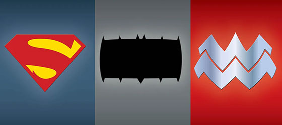
But most noteworthy among the rebrandings were the new logomarks for three of their most flagship properties: Batman, Wonder Woman and Superman. And as the title of this post clearly states, they all absolutely suck.
Batman’s new logo silhouette has been transformed into a multi cutter tool’s blade, seeing as how it’s a very lightly serrated rectangle now. It seriously looks like if I were to trace this as a stencil onto a piece of sheet metal, cut it out and jerry-rig it into my Ryobi, I could probably use it to fairly efficiently cut through plastics or foams, if I were still at the stage of my life where I would make costumes for Dragon*Con.
Wonder Woman’s logo now isn’t too far from its old iteration, but much like many things that are feminine in nature and display now, it’s been widened, fattened and made to look all thicc, because it’s okay if not all women don’t look like Jim Lee interpretations of females, especially in comics. But in doing so, it’s almost as if they’ve been successfully bullied out of their own original identity by the growing Whataburger company, who didn’t really do a good job with their own branding to not act like they weren’t completely lifting the original Wonder Woman emblem in the first place.
So let the record show that the regional fast food burger company has successfully bullied the vaunted Wonder Woman out of using her own fucking identity. Poor form, DC.
Finally, we have Superman’s logo, which at least, manages to at least salvage their traditional five-sided pentagon shape, and is the one logo that seems to retain the closest to its original iteration. But much like in the world of typography, the original serifs have been lopped off of the S, and for whatever reason, the top left part of the emblem looks really fucking weird to me, because there’s no break in the red from the S and the edge of the emblem and it all bleeds together looking sloppy. I can interpret that the general thickness of the S probably wouldn’t accommodate for there needing to be any space near the edge of the emblem, but it just looks really off, like Capcom’s shitty logo for not putting any space in the second C and the O of their wordmark that bothers the shit out of me.
And if you were to focus on the yellow parts alone, it looks like a really erect dick about to really overshoot the toilet underneath it, and I hope that any of my zero readers were to read this observation, they would become unable to unsee it, and spread the opinion out to the rest of the world like an obnoxious virus.
So, in conclusion, DC Comics felt the need to reset their shitty universe once again, and for some reason decided to rebrand some of their most iconic properties in the process. And in changing logos that never needed to be changed in the first place, we’re left with a saw blade, a fat version of the Whataburger logo, and a dick and toilet emblem in the end.
gg dc, wp.
