Don’t, stop, comeback

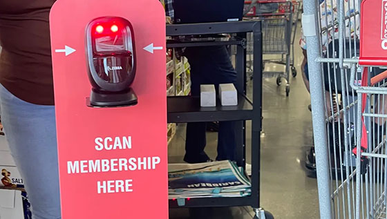
As if I had any more reason to like Costco more than I already do: policy change rolling out where customers must scan their membership cards at the door in order to enter, hopes that this cracks down on lax entrance policies for non-members; naturally this results in a lot of butt-hurt customers, most of which aren’t actually members and are just full of piss and salt that they can no longer freeload their way into the exclusive membership warehouse without escort from an actual member

When I originally heard of this change coming up, I didn’t think anything of it.  Being a paying card-carrying member, I shouldn’t have to give any thought about it, it’s just a difference of scanning my card at the door instead of showing it to some human being hardly paying attention to photo on the physical card itself and whether or not it matched my face.

The only person I share the account with is mythical wife, and the one time she ever received any resistance for trying to use my Costco Visa, I simply had a secondary card issued in her name and photograph so that it wouldn’t ever be an issue again in the future.

So back to the original point, the change of requirement to scan a card at the door doesn’t affect my household one iota.  As far as I’m concerned, the only people it affects are grubby cheapskate non-paying non-members who have a family member or friend who probably has Costco credit cards, and have given their physical membership card to them, to where they’ve been enjoying the benefits of a paid Costco membership without actually having to pay for them. 

These are the motherfuckers who are all pissy and up in arms currently at the policy change, because their freeloading ways are going to come to an end the minute their preferred Costco runs out these scanners, and they’ll be caught in the flesh when photograph on the screen doesn’t match their own physical faces.

And to these cheap assholes I say, fuck you, good riddance.  The membership fee is $65 a year, which is barely $5 a month.  I probably gain that $5 a month back whenever I purchase bananas from Costco, seeing as how they seem to be able to justify 3-4 lbs of bananas for like $1.99 and everyone in my household loves bananas.  If you’re the type getting bent out of shape over $5 a month, you honestly probably shouldn’t be shopping at Costco in the first place, seeing as how it’s nigh impossible to get out of there without dropping $100 a visit, before I even consider getting my $1.50 hotdog and fountain drink.

But really, I hope that all these cheapskates denouncing Costco and claiming they won’t ever come back, actually hold true to their words and don’t bend the knee and drop their $65 a year to become members themselves.  Costco trips are already crowded enough as it is, and I’m really hoping that this culling of cheapskates will help thin the crowds out a little bit in the parking lot and in the store itself, to where I can go on a Sunday and not feel like I’m on the cusp of being at Costco Shanghai at times, and I can have slightly reduced stress crowds the next time I go.

When the day is over, I have all the faith in the world that Costco is making the right choice; most everything else they do in the name of business seems to work out just fine for themselves, as well as often times aligns well with my own personal beliefs and ideologies.  And cutting the fat of fat cheapskates from my in-store experiences is definitely something that I can get behind, and I tip my cap, once again, to Costco.

Good riddance, Pearl

TIL: the Atlanta Braves will be moving their Double-A minor league affiliate from Pearl, Mississippi to Columbus, Georgia.  They will also be ditching the Braves moniker and will hopefully be something chintzy and marketable

Not that I pay attention to every iota of Braves coverage as I once did at a point in my life, but as a fan of minor league baseball, and for lack of a better term, a fan of the Atlanta Braves, news like this piques my interest, even if this were reported way the fuck back in January of this year.

I mean, I knew that the Braves had relinquished control over all of their minor league squads back in 2021 like selling their debts, and I didn’t hate the news at all quite the contrary, because I felt that it opened the door for Braves affiliates to spread their wings and try to be something more in the spirit of minor league baseball, instead of the boring, stuffy and sterile branding of “The Braves.”

Gwinnett (AAA) had already switched over to becoming the Strippers Stripers, and Rome (A+) as of this years ditched being the Braves and became The Emperors, as in Roman emperor, and better yet, adopted emperor penguins to be their team’s mascot.  Not that I’ve been paying any attention, but for whatever reason, the Mississippi Braves had remained as such over the last two-plus seasons, and despite their freedom to do so, they didn’t appear to be in any rush to make any changes to the organization.

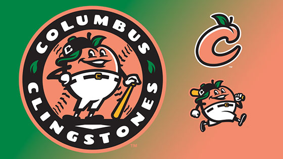
Until this season apparently, as it was announced that the club will be moving out of Pearl, Mississippi and moving to Columbus, Georgia, as well as ditching the Braves moniker and will be adopting a new name for the start of the 2025 minor league season.

At first blush, my thought was, oh great here we go again with a brand new fucking ballpark to build, but it turns out that there’s apparently a historic ballpark in Columbus, Golden Park, that will actually be renovated and used to house the future Columbus Braves affiliate, instead of building something from scratch.  Granted, a renovation isn’t cheap either, and I’m sure it will probably be something of a $65M tax burden for the people of Columbus to absorb, but that sure beats the $126M it took to build the Braves’ Spring Training facility from scratch in Sarasota.

Regardless of the financial burden of accommodations, this is actually a change that I don’t immediately just want to shit on upon hearing about it.  Having been to Pearl, Mississippi, solely to watch a M-Braves game, I have to say that getting the fuck out of that shithole in the middle of goddamn nowhere is nothing but good news for the Braves and frankly, all of Minor League Baseball in that nobody again will ever have to step foot in Pearl/Jackson, Mississippi after the 2024 season.

It’s the only place I’ve ever been to where I genuinely felt like I was whisked back in time at the casual ignorant racism that got in just a singular afternoon in town, from the moment I left the airport, to getting to the ballpark, and while simply getting food.  The cabbie who picked me up from the airport thought that I had to have been an actual player since I was headed to the ballpark, and upon arriving at the ballpark, I caught some kids staring at me and thinking I was Hideki Matsui.

It’s clear that Asian people aren’t a common occurrence in this chunk of the country, but god damn.  During the game, I was puckish so I went up to a concession stand where there were unsurprisingly chicken tenders and fries, and when I handed over my debit card to pay, the lady at the register examined my card and put down her bifocals, and then said to me, “oh that’s an easy one.”

Obviously having no fucking clue to what she was talking about, I asked her what, and she responded that it was my name, that it was one of those names that wasn’t too hard to pronounce.  Okay then

So needless to say, it seems like a monumental win for any person or any business or in this case, any team, to get the fuck out of Pearl, Mississippi, and head closer to somewhere that’s closer to their parent organization.  Columbus isn’t a tremendous step up from Pearl as far as not feeling like you’re in the middle of nowhere, but at least it’s a military town where people have had some etiquette and discipline beaten into them, and it’s only like a 2-3 hour drive to the Metro Atlanta area if anyone wants to feel some actual civilization.

I’m excited to eventually find out what the team will lean towards as far as a new team name, branding and identity will be.  I don’t know much about Columbus other than it being a military town, so I can’t take any snarky takes or come up with any sarcastic names to anoint them as, but hopefully the yokels out there will have the wherewithal to steer clear of the low-hanging fruit of Christopher, whom we all with brains have heard wasn’t exactly the best guy in history.

But hey, there’s always the Columbus Barves, wouldn’t that be some shit, to take the popularized typo-meme-unofficial sarcasm name for whenever the team fucks up, and make it official?  A guy can dream.

Let’s talk about Cobra Kai S6.1

Disclaimer: I make no promises that I won’t write anything that could be construed as a spoiler.  Heck, even the photo above could be considered a spoiler to some with defined opinions, but I don’t really think it is, given the development brought on in S5.

But unsurprisingly, as rare as it is for me to do in my life, I was on top of, and I’ve already finished watching the first installment of Cobra Kai S6.  I knew it was going to be multi-part, because Netflix is diabolical like that, and American media is incapable of finishing any story in a singular, logical, digestible experience, and either makes it abysmally short and rushed like Game of Thrones, or in the case of Cobra Kai, Infinity War, Fast X, Harry Potter, and The Hunger Games to name a few, requiring multiple installments.

However, I was mortified to find out that the final season of Cobra Kai wasn’t going to be just two installments, but three motherfucking installments, culminating probably around this time next year.  I don’t know definitively, but I want to say that it’s already been all filmed and wrapped up, and this is just Netflix further creeping towards becoming cable television #2, by making viewers wait instead of the binging everyone prefers to do.

And I really hope that it’s true that they’re done, because the cast of this show is starting to really show their age in embarrassing ways.  Kenny looks like he’s gone through puberty twice, and is basically bigger than all of the kids’ cast.  Demitri is now like 6’10, and it’s hilarious to hear a character talk about his advantageous size in a fight, when he was literally the worst kid to ever become a regular karate student in the beginning.  Daniel’s ridiculously hot wife Amanda is now showing the wrinkles above her lips that come with age.  Even Kyler, went from looking like a 22-year old high school underclassman in early seasons to looking like a 36-year old college freshmen trying to pledge for a fraternity.

Needless to say, if they haven’t wrapped up filming and plan on doing it all the way into next year, Kenny might be a divorced father of three by then, Chozen will have turned into Master Roshi, and William Zabka might start looking like old Vin Diesel by then.

As for the story and execution of the first installment of S6, absolutely nothing about it was any surprise.  The groups are all going to be preparing for the Sekai Taikai tournament, and of course there’s continued repeated spats between Daniel and Johnny.  The kids have seemingly all squashed their prior beefs, and it’s almost as insufferably peaceful like the Power Rangers the way everyone is so indoctrinated by Miyagi-Do.

Frankly it’s only the hints of chaos that seem remotely interesting, like the Mr. Miyagi’s mystery box of his past, and the family issues that befall Tory and the resulting actions, but other than that, the five episodes flew by in a relatively uneventful manner.

The series’ signature of dipping into the past and dredging up old characters wasn’t really that prevalent in these first five episodes, and I still believe that within the final ten episodes over two installments, it’s inevitable that Hilary Swank will show up, with the off-chance that Jackie Chan, Iron Monkey, Jaden Smith or any of the kids from the Kung Fu Kid makes appearances, so that literally every gamut of the previous Karate Kid films can be referenced at some point.

But the one thing that I really wanted to talk about and what spawned the urgency to make this post, was what was shown at the very end of the fifth episode.  Okay, **[spoiler alert]**

It took me a few seconds after the big reveal that Cobra Kai was still alive and well, despite the collapse of their American operations courtesy of Terry Silver, that the new and most fucking definitely improved logo, was in Korean.  Like when Kwon and two unnamed Cobras came walking out in slow motion in the traditional black gi with the giant cobra on it, I was kind of just like ohhhh shit, but then my eyes did a double take, and I could see that the Cobra Kai wordmark was in Korean, and then I was like OHHHH SHIT

Despite my general fandom of the Karate Kid franchise throughout my life, and general appreciation and admiration for the fire branding of Cobra Kai itself, I never did ever get any shirts or hoodies with the OG logo.  The hipster in me defied the all the other hipsters who all swooped up and bought shirts and hoodies, and I kind of didn’t want to just be another one of them.

But a Cobra Kai logo, written in KOREAN, I’m just like, there has never been something in existence more tailor made to well, me, ever in existence of humanity. 

This is something that belongs to me, and other Korean people who are fans of the franchise and the brand.  This does not belong to any of the Koreebs, the white people, the black people, or anyone else who also are Cobra Kai fans who already have their OG black, yellow and red Cobra Kai stuff.

I was like, I have never needed this logo on a piece of apparel more than anything in my entire life.  And at first, I had a tremendous amount of dread that this would not be produced, much like the absolute nuclear gold mine the show and Champion athletics sat on but never did anything with, but upon doing a cursory Google search after watching S6E5, I found some immediate results.

I had concerns that these were probably like some cheap bootleg shit from Temu or Alibaba or some shit, but then I found a link to this Hot Topic shirt, and as easy as it is to dunk on Hot Topic, they still carry some semblance of legitimacy in my opinion, and despite the fact that I typically have choice paralysis and can never pull the trigger on anything, I didn’t hesitate (beyond making sure I made the transaction on my laptop so I could get 2% Rakuten cashback) to purchase it, and eagerly await it’s arrival in the mail.

If for anything at all, the introduction of the Korean Cobra Kai logo, completely sets the season on fire for me, and I wait impatiently for the next installments of the show.  I still resent that they’re releasing it like this, but there’s no shortage of shit on my list that I can watch over the next few months to fill the time.

God damn I can’t wait to get my shirt.

Who needs Vegas when you can just go to Kroger?

I wish I had the imagination to make this shit up: South Fulton Kroger under scrutiny for basically opening a slot machine area inside of the store

I don’t even know where to begin with this.  It’s like a hungry lion jumping into a herd of gazelle but there are so many intriguing options that it’s hard to focus on just one, and they all get away and they go hungry, but in this case I don’t know what angle to start blabbing on about and this post is going to (already) turn into shit.

It’s funny though; I like Kroger as a company.  They used to be 24 hr. mostly until the pandemic so it was convenient to go whenever, and the bottom line was always that my dollars always stretched a little further at Kroger than say, Publix.  But ask anyone I know around here, and the general consensus is that Publix is a preferable grocer, because it feels cleaner and safer and more upscale in general, none of which I necessarily disagree with, but when I’m trying to stretch dollars, Kroger is still superior in that regard.

Granted, I still do the majority of my shopping at Publix, because there are literally two of them equidistant from my home and closer than the nearest Kroger and for daily needs and quick gets, time is money and distance wins out, but sometimes when I know I need to make a big trip, I’ll go out of my way and hit up Kroger, because at least where I am, they’re not as scuzzy as say, the ones in South Fulton are, which I am all too familiar with, seeing as how I lived there for 13 years.

But over the last few years, Kroger hasn’t done themselves any favors in the public eye, especially that of the one that resides over the Metro Atlanta area.  I mean, prior to getting hit with the Gentrification Bomb, we had Murder Kroger in the middle of the city, where at least three murders had occurred.  Then we had the Kroger in College Park that was accused of being racist for implementing a series of security vestibules that basically enclosed shoppers inside aisles to help deter theft.

And now we have a Kroger in South Fulton County that for some reason, has decided to put a miniature slot casino inside their store.  Prizes are not monetary, but they’re still slot machines all the same.  Like, my knee-jerk reaction is just to laugh at the sheer absurdity of such a wild idea, and just how flagrantly targeted it is at feeding into racial stereotypes and not even trying to hide it.

Like really, what the fuck business do slot machines have inside of a grocery store?  Even Las Vegas has steered away from the days of having rando slot machines in every gas station, CVS and restaurant, and you can go into a Smith’s or an Albertsons to get just your groceries and not be tempted to dump the remainder of your paycheck in some crappy Wild Cherry or Double Diamond machine.

But not this Kroger, who set up a loosely partitioned-off area with a few slot machines and some sad stools for people to really post up and get comfortable for a wallet-draining slot session.  And it’s at the front of the store, where it’s easy for people to come inside with the sole express of gambling away their money, instead of like Costco where they make you march all the way to the back of the store in order to get a $5 rotisserie chicken. 

Kroger Casino’s spot is where you’d see some other Kroger or Kroger-affiliated stores set up like a Subway, a Starbucks, or like eye glass repair or a tax prep kiosk; random conveniences meant to make you want to spend a little more time in the store to sway you to shop more on actual profit-making products.  But instead, it’s just a literal hole in the wall guarded solely by some portable plexiglass partitions with a sign on it that states one must be 18+ in order to play.

I’ve been to Krogers in the hood; maybe not this specific one, but I’ve been to some rough Krogers in South Fulton.  Usually against my better judgment, but the desire to save a buck or two, or sometimes they’re just conveniently on my route.  I don’t think for a minute that by the time I post this, there probably have already been at least 100 minors who have meandered into this section of the store without repercussion and drained at least $2,000 by now.  The store is definitely not going to spring extra for some fat slob with a fake badge and can of pepper spray to run security for this section, and it’s clear that the intent of Kroger is knowing that they will help create young gambling addicts, and by being in existence, help pad their own bottom lines at the expense of the poor and vulnerable.

As sad as this all is, and the painfully obvious message that it’s sending, all I can do is laugh about it.  It’s fucked up, but I still find it absolutely hilarious.  Kroger is in the making money businesses, and there clearly no moral or ethical boundaries in place if they have an idea that can make them some, and they’re absolutely not at all concerned over the optics of choosing stores in the hood of hoods to pilot such an idea out.

Next thing we know, there will be some form of legalized prostitution brought to you by Kroger, where customers can walk up to a different loosely partitioned section of the store, scan your Kroger Plus Card, and then chat with some store employee in a blue Kroger polo shirt about wanting to get 30 minutes with Kayla, before going into a makeshift brothel like in Taken to get your jollies off.

And of course, this would pilot in Forest Park, or Covington, Georgia, because the seedier the idea, the deeper into the hood they need to be piloted in.  Fresh for everyone!™

Wrestlemania XL brought to you by, MAGAlcohol

Originally I had intended on this post being a part of the post I had made about how Wrestlemania basically sold out as hard as a NASCAR event with how many sponsorships they’ve piled into the production of their grandest event of the year™, but I felt that it had some legs of its own and I had lots of jokes and puns that I thought were the best things ever, cementing my obvious status as the dad who makes dad jokes that are only hilarious to myself.

Among the numerous sponsors that the WWE allowed to dump money into ‘Mania this year, this particular one stood out leaps and bounds above the others for me, one because of just how uncomfortably white-wing it comes off, but also finding out that they’ve basically bought Cody Rhodes and plastered their branding all over his American Nightmare™ bus, but we’ll circle back to that part later in the post.

On purpose, I’m not going to use mention their name because fuck them for being some creepy dog whistle white-wing racist undertone company, but as if that doesn’t set the stage enough, that’s basically the gist of what their commercial and branding seems to exude.

It starts with a catch-phrase that does rhyme but doesn’t necessarily roll off the tongue so easily, and I want to play the Stewie Griffin game with their name, because of the “wh” in it, and that serves to ramp up the difficulty in saying their name or mocking their jingle.

But as the commercial continues to unfold, it’s as if they’re continuously doubling and tripling down on their pride of being whiter than, well, a right-wing gathering, because as the scenes change to larger and larger groups of what appears to be solely white people, it’s apparent that this is a company that really gives no flying fucks about DEI and they want viewers to know that.

They even have a ridiculous line where they ponder why Moscow gets the mule, and while looking up the YouTube video to take a screen grab from, they’ve already posted a recipe for “American Mule” which is basically the exact same thing as a Moscow Mule except not Russian; which in itself is laughable considering so many orange guy disciples love Russia as much as he does.

As the commercial ends, only one word or phrase popped into my head: MAGAlcohol, because that’s precisely what the fuck this shit actually is. 

I’m not much of a vodka drinker, other than the sparse times where I like a cranberry vodka, but I kind of feel bad for the spirit itself.  MAGAlcohol makes me not want to have any vodka in general, because it’s murdering the entire category for me as if it were a white cop pressing his knee on a defenseless black man’s neck on asphalt.

Getting back to Cody Rhodes, I was abhorred when footage of him arriving to the Linc was shown, and Corey Graves was being a good soldier, by not failing to mention that his entire bus was also co-sponsored by MAGAlcohol, and I could feel my eyes widen at the disgusting sight of it.  Just when I was beginning to soften my stance on Cody Rhodes, and beginning to turn face on my opinion of him, he has to go and associate with MAGAlcohol, and I’m pumping the brakes at how much I want to support him. 

In some regards, I get it, he’s the American Nightmare, his ring attire is basically a Homelander from The Boys skin, and he’s a white guy from Georgia.  There’s few guys at his stature in the business that would be as worth co-sponsoring as Cody Rhodes.

But he’s also a pretty sensible, intelligent human being, from what I can surmise from interviews and the way he conducts himself in and out of the business.  I would’ve assumed that he would’ve been a little more cerebral than to associate himself with a company that clearly has no hidden agenda on whom they want their demographic to be.

Oh and his wife is also black.  I know that Brandi Runnels seems to be as white-washed as perhaps I am, but when push comes to shove, white folks wouldn’t hesitate to throw her under the bus if there was an incident that needed a minority scapegoat and she was within eyesight.

Perhaps it was out of his control, and it was the bigwigs at the E that forced it onto him.  But I would’ve also figured Cody, by now, and at his position within the company, would have the ability to veto this if he really wanted to.  But as so many legends in the business have so often said, the business is all about as making as much money as you can, because there will come a day when you can do it anymore.

Not that I think Cody was starving before his associate with MAGAlcohol, but accepting more money when you’re already rich is among the whitest things a white guy can do, so unfortunately, as much as The Story has been compelling, there is a little turd in the celebratory punch bowl, that most definitely does not make it go down so sweetly.

Finally, a sponsor patch I can get behind

See ya next time: Kansas City Royals announce a partnership with QT gas stations, including a sponsorship patch on all team jerseys

Sponsorship patches seemed inevitable in MLB, seeing as how sponsorships on jerseys have been pretty commonplace pretty much in every sport in every other country across the globe.  But America being ‘Murica, it was unsurprising that once they started coming to fruition, all the sponsors were all of these boring, homogenized, multi-million dollar entities that nobody has ever heard of, cared for or generated any sort of emotion other than ambivalence, indifference, or the need to make fun of them.

The New York Mets, of course, were one of the first ones to really mess things up by introducing a hilariously oversized patch that nobody is going to convince me probably didn’t mess up the performance of players, since they had this giant square of weighty fabric hanging off of their left sleeves, that they had to finally swallow their pride, admit my bad, and fix it.

Of course, the Atlanta Braves got into the action as well, seeing as how Braves Corporate™ loves money and will do absolutely literally anything if it meant pleasing shareholders or improving their portfolio.  And despite how amazing it would’ve been if it were something truly iconic to Atlanta like Coca-Cola, Delta, The Home Depot, or my personal favorite thing I would’ve marked out for, Waffle House, nope, had to be a boring-as-fuck bag of concrete Kwikrete instead.

But today, we have news of a partnership that truly makes me smile, from the satisfaction of it being a team I don’t dislike, a company I don’t dislike, and all of the positive associations I get from said company, and knowing two parties that I don’t dislike coming together to make business.  It’s like when you have two friends from separate circles meet, and they gel together well.

But the Kansas City Royals partnering up with QuikTrip is something that does bring me joy.  The Royals are one of those teams I can’t ever bring myself to dislike, and who could forget the 2014 and 2015 seasons when the Royals came close, and then succeeded on their redo.  They’ve always had players that I’ve generally liked* and they so rarely ever cross paths with the Braves, so there’s almost never any chance that I’d ever feel the need to root against them.

*except Melky Cabrera, that fat worthless fuck who went to the Royals after his putrid stint with the Braves, where he played the season at like 304 lbs. before losing a hundo when he joined the Royals and put up an MVP-type season

And then there’s QuikTrip, which actually has a lot of Georgia ties, with their food distribution centers, I have a lot of positive connotation when I think about them.  Often times with the cheap fuel, always open, decent food as far as gas station grub is concerned, and always with expedient and mostly friendly staff.  I often tend to favor a QT when given choices, and when I think of QT, I hold them in a positive regard.

So the Royals joining forces with QT, makes me pleased.  Especially, with them hilariously slapping a giant red and black QT logo onto the Royals jerseys which are a hard blue and white identity, which really begs the question on the importance of branding.   Like, if the name of the game is for the sponsor to really stand out, they couldn’t have picked a better team to partner up with than the Royals.  If they partnered with the Cardinals, Braves, or even the Diamondbacks, which are all markets that have QTs, their logo would blend in with all the other reds that those teams employ.

I don’t travel much anymore these days, and my baseball journeys are long past complete.  But I’d totally be down to go to Kansas City if they ever did a free Royals jersey giveaway night sponsored by QT, where they were giving away jerseys with the QT logo on them, because to my knowledge replica jerseys made by Nike/Fanatics don’t include sponsorships on them, and I sure as fuck wouldn’t want to buy any of the shitty replicas made by them these days anyway.

Either way, Royals + QT, and a bigass sponsorship patch on their blue-ass jerseys definitely piqued my interest, and I look forward to seeing Royals highlights throughout the upcoming season.  This is definitely my favorite sponsorship partnering there is in baseball, without any question.

Not my MiLB logo

Apparently I missed this way back from September: but Major League Baseball and Minor League Baseball have agreed to change the official logo of Minor League Baseball

And of course this wouldn’t be a post if I didn’t, but I absolutely hate it, thanks.

Fewer things are a sign of mediocrity and spinning wheels like a logo rebranding.  This was not a case like the Cleveland Indians really needing to get rid of a horrifically racist mascot, this was the case of some bored corporate stooges looking for things that weren’t broken and decided to fix them anyway, to justify their existences.

There was absolutely nothing wrong with the previous MiLB logo.  It was subtle, it was understandable, and most importantly, it was just different enough to where the shape and brand positioning of it was always consistent to MLB standards, but the visual identity of the icon itself was different enough for those looking to understand that this was Minor League and not the MLB icon that any sports fan or casual could understand.

In one of my favorite pictures I’ve ever taken with my mom, I’m wearing the old MiLB logo generic shirt.

Now this new crappy logo is basically identical to the MLB logo, except the batter is aligned to the left, and instead of a baseball coming towards the batter, it now looks like the batter has sat looking at four pitches that are now past him, and considering the escalating rate of strikeouts throughout the last half-century, the guy in the logo has probably struck-out, as much as the logo itself does in my opinion.

I hate to say it, but there are a lot of baseball fans that aren’t particularly intelligent.  The Gwinnett Braves used the excuse that there were people that actually managed to confuse tickets for G-Braves tickets for tickets for the Atlanta Braves, which I didn’t think was really a believable excuse, but I’m also not going to pretend like baseball fans are always the smartest people in the world either.  This new logo is going to 100% confuse people into thinking they’re going to Major League games and buying Major League apparel, but perhaps that really is the end game, and I’m just being hyper critical of a tactic that I think is petty, but is really some corporate shills really living in 2050 and playing chess.

And I don’t understand why they’ve put a color palette behind it, especially of two shades of blue.  MLB logos, especially on apparel, namely baseball caps, often times already ditch their own color palette and adopt the primary and secondary colors of the team, or they just go reverse white, as not to compete with the colors of the teams, especially ones that don’t utilize the navy and red palette of the MLB logo.  This Carolina/Dook blue combo logo just seems odd and uncharacteristic to professional baseball in general, where it seems like the vast majority of teams utilize shades of red, at all levels of the game.  For all the teams like the Blue Rocks or the Stone Crabs or the Pelicans that utilize shades of blue, there are teams like the Redbirds, Nuts, Crawdads and much more where adding a logo of blues into their branding is more like shoehorning a horse’s hoof into a toddler’s shoe.

Either way, I am very much not a fan of the new MiLB logo.  It is uncreative, homogenized, convoluted, and was something that never needed to be updated in the first place.  Not that I’m going to many baseball games at all these days, but a team’s branding is going to have to work just a little bit harder to make me decide to impulsively drop some cash on any team merch if it’s going to have this little blue turd of a brand slapped onto it.

There may be four stars on the logo, but if it were up to me, it would have none.