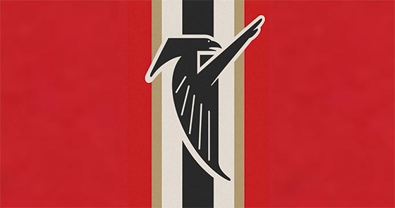
Yahoo Sports: Atlanta Falcons obliterated by the internet for unveiling a logo that resembles too closely to Nazi imagery
I often reference this, and it’s bad on my part that I can’t find the actual quote of it again, but there was once this saying I remember reading in regards to the topic of brands that rebrand too frequently, along the effects of, no better indication of mediocrity than frequent rebranding.
The obvious logic is that the brand and/or company is trying to hide the fact that they’re mid as fuck or worse and is trying to smokescreen the sad reality with distracting imagery and new logos.
I moved to Georgia in 2003, and since I’ve lived down here, the Atlanta Falcons have changed their logo two times, three if you count this debacle that they seem to have pulled back on like they were slamming their brakes like Takeshi Nakazato. The thing is, I kind of feel like I get what they were trying to do, incorporating the red, white and black stripes they used on their uni pants pre-2003, but never did they have the Falcon logo on top of it like they had done, and clearly nobody stopped to think of what it might resemble when they put it together.
And as is often stated when a juicy meme goes into the general population and goes viral, the Internet remained undefeated, with their quick and sharp evisceration of the Atlanta Falcons profile picture. Aside from the headline that I clearly hoisted for the title of this post, I saw a lot of bonkers-good quips and lines that made this some red-hot entertainment for a few hours:
I give this a nein (out of) 10
The Bird Reich
28-3rd Reich
Falcons were up 28-3 at Dunkirk
Falcons leading the league in blitzkrieg
And so on, and so on.
Obviously, I have some other thoughts on the matter, otherwise this wouldn’t be a brog post; the first of which is that whomever made this logo, surely, has to be the same guy/company/agency who did the logo for the Metro Atlanta elementary school rebranding for East Side Elementary, seeing as how they basically lifted the Nazi eagle emblem for their school. And that it’s both sad and concerning how there are creatives out there that are either that uneducated, and/or are that insistent and determined to sneak Nazi imagery into logos that will be seen by the public and hope nobody notices. Also that they both happened in the Metro Atlanta area is something that is disheartening to me, as a resident of the region, but then again, we had actual full-ass Nazi demonstrations not that long ago, so it’s not like they’re trying to really hide or anything either.
Additionally, it’s no secret that the owner of the Atlanta Falcons is Arthur Blank, and it’s no secret that he’s the co-founder of The Home Depot, and it’s no secret that his co-founder was Bernie Marcus, a Jewish man. Both are massive pillars of Atlanta just beyond the Falcons and THD; they created the Georgia Aquarium, and have their collective fingerprints in all sorts of projects and companies throughout the state. Blank may be the owner of the Falcons, but Bernie’s fingerprints are still all over the place.
I’m going to assume Arthur had nothing to do with, and probably didn’t see the logo before it went out, because he’s a pretty smart guy, and I’d hope he’s at the age where his education level might have encompassed WWII and a bit of background history on the Nazi party, and may have realized just how fucked up and disrespectful to his late-partner and friend might have been.
Either way, this was funny for a minute, but the reality is that the Atlanta Falcons still suck as a football team, and this was a really hilariously bad attempt to smokescreen their below-average season with fancy pictures, but at the same time it seems appropriate that a team that’s as piss-poor on the field is performing as piss-poorly off of it.